
Benefits use CCS
A demonstration of what can be accomplished visually through CSS-based design. Select any style sheet from the list to load it into this page.
This is a learning exercise as well as a demonstration. You retain full copyright on your graphics (with limited exceptions, see submission guidelines), but we ask you release your CSS under a Creative Commons license identical to the one on this site so that others may learn from your work.
Primary is a simple…
Primary is a simple CSS Framework, designed for Developers and Designers in order to make using CSS as easy as possible.
Primary is an experiment based on the concepts of legendary comic book artist Wally Wood’s “22 Panels That Always Work“.
Twitter:
@PrimaryCSS
Email:
Trench@PrimaryCSS.com
CSS Chapter 2
As we explained in the previous chapter, HTML elements enable Web page designers to mark up a document as to its structure. The HTML specification lists guidelines on how browsers should display these elements. For example, you can be reasonably sure that the contents of a strong element will be displayed bold-faced. Also, you can pretty much trust that most browsers will display the content of an h1 element using a big font size… at least bigger than the p element and bigger than the h2 element. But beyond trust and hope, you don’t have any control over how your text appears.
CSS changes that. CSS puts the designer in the driver’s seat. We devote much of the rest of this book to explaining what you can do with CSS. In this chapter, we begin by introducing you to the basics of how to write style sheets and how CSS and HTML work together to describe both the structure and appearance of your document.
This is chapter 2 of the book Cascading Style Sheets, designing for the Web, by Håkon Wium Lie and Bert Bos (2nd edition, 1999, Addison Wesley, ISBN 0-201-59625-3)
tip:
To start using CSS, you don’t even have to write style sheets. Chapter 16 will tell you how to point to existing style sheets on the Web.
Introducción – Tutorial CSS gratuito

Las hojas de estilo en cascada (CSS, acrónimo de Cascading StyleSheets) son una herramienta fantástica para añadir presentación a los sitios web. Pueden ahorrarte mucho tiempo y te permitirán diseñar sitios web de un modo totalmente nuevo. CSS es imprescindible para todos aquellos que trabajen en el campo del diseño web.
El presente tutorial te iniciará en el uso de CSS en solo unas horas. Es fácil de entender y te enseñará todo tipo de técnicas sofisticadas.
Aprender CSS es divertido. Según vayas avanzando en el contenido del tutorial, recuerda dedicar el tiempo suficiente para experimentar con lo que hayas aprendido en cada lección.
Para usar CSS es necesario tener una experiencia básica en HTML.. Si no estás familiarizado con HTML, empieza, por favor, con nuestro tutorial HTML antes de adentrarte en CSS.
¿Qué software necesito?
Evita, por favor, usar software tal como FrontPage, DreamWeaver o Word con este tutorial. Este tipo de software tan sofisticado no te ayudará a aprender CSS; más bien, te limitará y reducirá de modo significativo tu curva de aprendizaje.
Todo lo que necesitas es un editor de texto sencillo y gratuito.
Por ejemplo, Microsoft Windows incorpora un programa que se llama Bloc de notas. Se localiza normalmente en el menú de Inicio, sección Todos los programas dentro de la carpeta Accesorios. Si no es éste, puedes usar un editor de texto parecido, por ejemplo, Pico para Linux o Simple Text para Macintosh.
Este tipo de editores de texto sencillos son ideales para aprender HTML y CSS puesto que no afectan o cambian el código que vas tecleando. De esto modo, los éxitos y errores sólo se te podrán atribuir a ti… y no al software.
Puedes usar cualquier navegador con este tutorial. Te animamos a que mantegas siempre actualizado tu navegador y uses la versión más reciente.
Un navegador y un sencillo editor de texto es todo lo que necesitas.
¡Nos ponemos en marcha!
The history of a model for fonts on the Web
![]()
Bert Bos | History of WebFonts
To view: switch to full screen
(With Javascript: press A)

SXSW conference
Austin, TX, USA
March 13, 2010
1994–1996: before WebFonts
< Oct 1994:
User style sheets
Oct 1994:
Author-reader balance
→ font problem
font download?
font synthesis?
most similar?
CSS level 1 (1996):
Font set
Generic families
(serif, sans-serif…)
In 1994, I was working on a browser (optimized to integrate the kind of information sources that scholars in the humanities use). It handled a subset of SGML, including HTML, and it had style sheets. The style sheets had many features that are still in CSS, and, of course, it specified fonts. But there was no particular difficulty with that, because the style sheets were strictly for use by the reader. A reader presumably wouldn’t specify a font he didn’t actually have.
Then in October 1994, Håkon Lie posted his proposal for style sheets. There were two or three others than ours, but his caught my eye in particular for one feature: it postulated a (yet to be specified) algorithm to balance the author’s desired style against the reader’s.
We combined our ideas and the result was Cascading Style Sheets. In syntax it doesn’t resemble either of our two style sheet languages, but most of the features are still there. But now we had a problem with fonts…
If you negotiate, say, the author’s request for red text and the reader’s preference for blue text, you may end up with red, blue, or even something in between, but it is still a color and technically you can draw it. (The aesthetics is another matter…)
But if you combine the reader’s choice of font A with the authors preference for B, and the algorithm yields B, it may well be that font B isn’t actually available. We considered several solutions, but most of them could be dismissed immediately.
We thought about downloading (embedding) the font, but (1) fonts are big and even on the academic networks of the time you wouldn’t want to wait for a font to download; and (2) there was no common font format.
We thought about font synthesis as well: pass something like a PANOSE number and create a font with those characteristics on the fly. But such a font is likely to be so ugly that both author and reader would prefer some other font instead.
We thought about finding the most similar font, again based on something like PANOSE numbers, but that would probably also lead to a font that neither author nor reader would have chosen.
And in any case, we couldn’t make the style sheet language too complicated, because it had yet to be adopted…
And so we settled on a solution in two parts:
- The concept of a font set, i.e., the author can specify a list of fonts in order of preference in the hope that one of them at least is available on the reader’s machine.
- Five generic font family names (serif, sans-serif, monospace…) so that an author could specify that, if none of his fonts was available, he at least wanted a serif font.
That became a standard (W3C Recommendation) as CSS level 1, in 1996.
1997–1998: WebFonts!
April 1996
First Fonts WG
synthesis
PANOSE
font metrics
download & (virtual) embedding
any format
type-1, truetype, eot…
CSS level 2 (1998)
@font-face
While CSS level 1 was going through its final reviews, in 1996, we started working on CSS level 2. CSS was well received and we thought we could add a number of features that we wanted, but that had been too advanced for level 1, including font download.
We created a working group, the first incarnation of the Fonts Working group, and asked Adobe to explain what they had done for PDF. With their help, but also Bitstream, Microsoft and others, we created WebFonts, also known as the ‘@font-face’ rule of CSS.
The group’s results were integrated into CSS level 2 and allowed not only font download, but also synthesis of a font with the same metrics (primarily meant to bridge the time while waiting for the font to download).
There still wasn’t a clear clear common font format for all platforms. So we didn’t recommend a single format, but provided an open-ended list that included, among others, Type-1, OpenType and EOT.
CSS level2 became a standard in 1998, and then we waited to see what would happen.
Microsoft implemented the download feature straightaway, using their own EOT format. Which made sense, because EOT seemed to have tackled the copyright problem. (Of the handful of free fonts that existed at the time very few were any good.)
In the context of the browser wars that raged at the time, Netscape decided to implement something completely different. They used a technology from Bitstream called PFR (Portable Font Resource) to try and offer similar capabilities, but without using the WebFonts framework. The result wasn’t very good and distributing commercial fonts as PFR was probably illegal in many countries, too. Now, in 2010, PFR as such still exists, but it is no longer supported on the Web.
And for a long time, nothing else happened…
2006–2008: need for a format
2006: Image Replacement Techn.
CSS WG decides to act
Simplify WebFonts?
Enhance ‘content’ prop.?
Standardize font format?
Formats:
SVG?
OpenType?
OpenType in zip file?
2008: Microsoft & Monotype submit EOT
Turns out to be easy to implement…
EOT, the only format available with WebFonts in practice, was in use in some parts of the world, especially for languages for which there were few fonts available, but it couldn’t be called a big success. Designers rarely used it and no other browsers than Microsoft’s Internet Explorer had implemented it.
Then, at one of its meetings in 2006, the CSS working group discussed a phenomenon that was clearly on the rise on the Web: image replacement techniques.
When CSS was started in 1994, the reason wasn’t just to make Web documents more beautiful, it was also to provide an alternative for practices that went against our goal of a semantic Web: <FONT> tags, images instead of text, spacer elements, etc. We wanted HTML documents to be accessible, device-independent, easy to maintain, and re-usable, and so we tried to make the separation of text/structure from style as easy and attractive as possible.
The image replacement techniques were not quite as bad as the original practise of putting an image in an HTML document. In their case the text was still in the document and the images only in the style sheet, but they still led to accessibility problems and documents that were hard to maintain. E.g., you cannot cut and paste text when the text is replaced by an image.
We, the CSS working group, decided that the designers were clearly demanding better font support. We could improve some small things in CSS here and there, but the main job seemed to be to get WebFonts (the ‘@font-face’) adopted. We decided to enhance the ‘content’ property and simplify WebFonts by removing the font synthesis part, and we discussed formats: what formats would lead to the most supply?
W3C now had a graphics format, SVG, that included a way to define fonts. We expected (and it seems we were right) that SVG would eventually come to be integrated with Web documents. But SVG fonts were not a sufficient answer. They lack advanced features that you find in OpenType, e.g. And they don’t solve the problem of commercial fonts, which you cannot just put on the Web for everybody to copy.
Because, although by now the number of free fonts had increased, it seemed designers wanted to use commercial fonts, such as the ones that come with Adobe Illustrator.
EOT promised to solve that problem. It had apparently both the full power of OpenType and a solution for distributing a font without losing the information about its license. Independently of each other, both Håkon Lie and I challenged Microsoft to open up the format and show how it could solve our WebFonts problem.
They did. The person who made it all happen was Paul Nelson, one of Microsoft’s representatives in the CSS WG at the time. He got the right people to sign off on the submission of EOT to W3C, and he found and cleaned-up the EOT documentation. But from the speed with which he got the approval I suspect Microsoft had already started thinking about opening EOT before we asked.
Paul even managed to convince Monotype to join W3C and submit their patented compression algorithm MicroType Express, which is used in EOT. Submitting a technology to W3C implies that it becomes Royalty Free if it becomes a W3C standard.
There is some administrative work involved in preparing a document in the right format for publication as a W3C submission, but in March 2008 EOT and MicroType Express were published as a joint submission by Microsoft and Monotype.
Based on what EOT was supposed to do, I had imagined what it would look like on the inside. But I was afraid that it wouldn’t be like that at all, because experience shows that document formats that come out of Microsoft aren’t always as elegantly designed as one might wish. But it turned out to be everything I had hoped for.
EOT is simple and straightforward. It has one or two things that are redundant, but not harmful, and easily removed. It has a tiny bias towards Windows, but also nothing that can be fixed easily.
To prove to myself that it is indeed as easy to write software for as I thought, I recently did just that. It took me just one day to write a program to read and another to write EOT files. On a Friday night I wrote eotinfo, to decode an EOT header and display its contents in a readable way; and on the Saturday I wrote mkeot, which creates and EOT file. And so far they work perfectly.
So, in March 2008 I thought we were nearly done. EOT didn’t need much work to be made into a proper W3C Recommendation. We just needed to check that the font industry was indeed willing to use EOT, as Microsoft believed. There were indications that that was indeed the case.
2008: talks w/ font industry
What do designers want?
What does the font industry want?
W3C talks to many people
A few want DRM…
…but as long as EOT becomes a standard they will accept that, too
End of 2008: EOT is looking good!
During the summer and autumn of 2008, I talked to many people in the font industry: font makers, font vendors, makers of font software, and designers. I met big companies (Monotype/Linotype, Adobe) but also small and tiny little companies. And some of my colleagues at W3C did the same.
The conclusion was that there was a range of preferences: from people who wanted EOT to people who would rather have something with DRM, but who were at the same time realistic enough to see that DRM is not in the current zeitgeist and were willing to accept EOT, once it was a standard.
What made EOT acceptable, even though it does nothing to make copying difficult, is that it at least makes doing the right thing easy. Anybody who wants to redistribute a font that comes as an EOT can easily see what the license is. The core of the license is even machine-readable, so you don’t have to know English.
In other words, by the end of 2008, things looked good. And I already calculated: six month to rewrite the EOT specification, fix the ambiguities, and add the conformance requirements; six month more to create a test suite, make the first implementations and test them, and by the end of 2009 we would have a standard for font embedding on the Web and our old WebFonts would finally come into its own.
I was wrong.
2009: talks w/ browsers
Opposition from browser makers
Compression costly
Usability of EOT vs raw OpenType…
DMCA in the US
Can you exclude that somebody considers EOT to be DRM?

I hadn’t thought the other browser makers, in particular Opera, Mozilla and Apple, could be opposed to EOT. They were already showing interest in WebFonts and EOT looked easy enough to implement. We could talk about dropping some optional parts, such as the compression, but those were details, weren’t they?
In reality, when W3C proposed to resurrect the Fonts Working Group in order to standardize the next version of EOT, the three browser makers protested violently.
There were arguments about the usefulness of the special compression. Was it worth adding new code to the browser for a compression that was better, but not an order of magnitude better than the compression that the Web already used, viz., gzip?
There were arguments about usability: even though authors are used to adapting all resources for the Web (from Word to HTML, from TIFF to PNG, from 10 megapixels to less than 1, etc.) if they could just use TrueType and OpenType, instead of EOT, that would avoid one step.
But the argument that wouldn’t go away after discussions was the DMCA. The DMCA is a law in the US that is meant to better protect copyrighted works and one of the things it does is to make it a crime to circumvent an effective technical measure that is designed to make copying difficult. In other words, circumventing DRM.
The scenario is as follows: imagine somebody implements EOT according to the standard. That means that the software looks in the EOT header for one or more URLs and does a string comparison of those URLs against the URLs of document it is about to render. If one of the URLs matches, the font can be used, otherwise not. Parsing the EOT header is a few dozen lines of code and the comparison itself is two lines.
Now imagine somebody else takes that software and removes the two lines that compare URLs. The result is a program that applies fonts in all cases, against the standard and, in some cases, against the licence of the font.
If you can find a judge who is willing to claim that those two lines constitute an effective DRM and that removing them is tantamount to circumventing it, then you can claim that the author of the original software is an accomplice, because he provided most of the code.
It’s an unlikely scenario, but it is apparently enough to stop any attempt to protect copyright as long as the DMCA exist. Software makers simply do not want copyright information that can be read by software. Because when it cannot be read, you cannot be liable for not reading it.
2010: WOFF
Need a format that:
contains all of OpenType
(even future versions)
but is not OpenType
no license info
requires little code
not much less efficient than EOT
WebOpenFontFormat
like compressed OT with new header
There were ideas for an “EOT light,” a version of EOT without license information, with the idea that the fact that it was a special Web font and not normal OpenType would at least tell people that the font wasn’t meant to be copied and installed locally. But using EOT for that was also confusing, given that existing software already offered more features.
So we settled on a new format, called WOFF, that was proposed by Mozilla. Just like EOT, it contains a full OpenType file and thus keeps all the advanced typographic features, but the OpenType file is embedded in the WOFF file differently than in an EOT file, and the file is always compressed with gzip.
W3C now proposes that the new Fonts Working Group makes a standard from WOFF. At this moment, March 13, 2010, the official review period is over since a few hours, but the results aren’t known yet. They are expected around April 1.
I’m still optimistic and so I already invite all of you to join the effort, starting in April. If you’re a company, you can join W3C and become a member of the working group. We’ll need people to help with editing and testing. You can also join the public mailing list <www-font@w3.org> and help us develop the specification and promote the result. Joining the public list is open to everybody and implies no special commitments.
2011-…: WebFonts for real?
A new Fonts WG is under review
We should know more by April

In any case:
join us on
<www-font@w3.org>!

Cascading Style Sheets
Partial CSS software list
Nearly all browsers nowadays support CSS and many other applications do, too. To write CSS, you don’t need more than a text editor, but there are many tools available that make it even easier.
Of course, nearly all software has bugs. And some programs are further ahead implementing the latest CSS modules than others. Various sites describe bugs and work-arounds.
Support charts
Links to official feature lists of various products.
- AH Formatter: 5.1
- Firefox: 3.5 beta (draft)
- HTMLayout: ?? (properties/selectors)
- Internet Explorer: 5, 6, 7, 8
- Konqueror: 3.4
- Opera: 9.5, 9.80, 10.00, 10.10, Mobile 10, 10.50
- PDFreactor: 4.0
- Prince: 5.1, 6.0, 7.0
- Safari: 1, 2, 3, 4
Several people maintain independent CSS support charts:
- Westciv’s browser support charts
- css3.info’s browser support for CSS3
- Wikipedia’s comparison of layout engines
- Web Devout’s Web browser CSS support
Las mejores pantallas táctiles del mercado

Se ha hecho una comparación entre las mejores pantallas táctiles de los mejores móviles de la actualidad HTC Desire HD, LG Optimus E900, Sony Ericsson X10, Nokia N8, iPhone 4, Nokia C6-01, Samsung Wave y Samsung Galaxy S. Esto es comparar, básicamente, pantallas LCD vs AMOLED vs IPS LCD vs Super Clear LCD, vs CBD AMOLED vs Super AMOLED, lo mejor que tenemos disponible en la actualidad. Veamos el cuadro en detalle para poder comparar:

En el gráfico podemos apreciar perfectamente las diferencias de color/contraste entre todas las principales pantallas, parecería que el Nokia C6-01 tiene una pequeña ventaja por sobre el resto, pero realmente hay cosas muy buenas de todos, incluso una amplia diferencia si lo comparamos con el tan promocionado Nokia N8, con lo que la tecnología CBD parece estar ganando la pulseada ante los AMOLED y Super AMOLED, y ya sabemos de sobra las cualidades de la pantalla del iPhone 4.
Si todavía no nos convencimos, les dejo un gráfico que lo explica más detalladamente para que veamos las principales diferencias:

Podemos ver cada modelo y qué tipo de pantalla tiene cada uno, y según los testeos que se han estado haciendo, qué tan bien reacciona cada una de ellas en las diferentes condiciones, ya sea viéndolos de perfil, de frente, con y sin luz y el promedio de rendimiento del color.
Una vez más, todos los datos para que cada quien elija cuál le parece que es su móvil ideal.
Vía mynokiablog
Manifesto for a Neutral Red

Manifesto for a neutral network Neutral Red
Citizens and businesses using Internet text attached to this state:
1. Internet is a Neutral Red by design, from its inception to its current implementation, in which information flows freely, without discrimination based on origin, destination, protocol, or content.
2. That businesses, entrepreneurs and Internet users have been able to create services and products in the Neutral Red without authorization or prior agreements, resulting in a virtually non-existent barrier to entry has allowed the explosion of creativity, innovation and service that defines the current network status.
3. All users, entrepreneurs and Internet companies have been able to define and offer their services on an equal footing taking the concept of competition to an extent previously unknown.
4. Internet is the vehicle of free speech, freedom of information and most important social development which have citizens and businesses. His nature must not be jeopardized in any way.
5. In order to bring the Neutral Network operators must carry packets of data in a neutral manner without being a “customs” of traffic and no advantage or disadvantage to some content over others.
6. That traffic management in specific situations and exceptional network overload should be undertaken in a transparent manner according to standard criteria of public interest and non-discriminatory and non-commercial.
7. That restriction outstanding traffic by operators can not become a sustainable alternative to network investment.
8. Neutral Red that this is threatened by operators interested in reaching commercial agreements which favors or degrade the content according to their relationship with the operator.
9. Some market participants want to “redefine” the Neutral Red to be handled in accordance with their interests, and that claim must be avoided, the definition of the fundamental rules of operation of the Internet should be based on the interest of those who use it, not those the supply.
10. That the response to this threat to the network will not be inaction, doing nothing amounts to allowing private interests to conduct de facto practices affecting citizens’ fundamental freedoms and the ability of firms to compete on equal conditions.
11. It is necessary and urgent urge the Government to protect a clear and unambiguous Neutral Network, in order to protect the value of Internet towards developing a more productive, modern, efficient and free of interference and interferences. This requires that any motion to approve inextricably linking the definition of Neutral Red in the content of future legislation that promotes and does not condition its application to issues that have little to do with it.
The Neutral Red is a clearly defined concept in academia, where it stirs debate: citizens and businesses have the right to traffic received or generated data is not manipulated, distorted, impeded, diverted or delayed in accordance with priority the type of content, protocol or application used, the origin or destination of the communication or any other circumstances unrelated to their will. That traffic is treated as a private communication and only under court order may be monitored, traced, stored or analyzed in its content, such as private correspondence that it really is.
Europe and Spain in particular, are in the midst of an economic crisis so important to force the reversal of its production model, and better use of the creativity of its citizens. Neutral Network is crucial to preserve an ecosystem that encourages competition and innovation for the creation of numerous products and services that are to invent and discover. The ability to network, so collaborative, and connected markets, will affect all sectors and all companies in our country, making the Internet a key factor in our current and future economic and social development, determining great extent the level of competitiveness. Hence our deep concern for the preservation of the Neutral Network. We therefore urge the Spanish Government urgently to be proactive in the European context and to legislate in a clear and unambiguous in this regard.
If you feel represented by this manifesto strongly urge you copy it and post it to your blog or mention it in your Twitter or Facebook using the hashtag # redneutral. Thank you!
Evidenced by a written Neutral Red Bitelia November 30, 2010 by earcos
Send to Twitter | Share on Facebook
¿Por qué los astronautas pierden a veces sus uñas?

Salir al espacio exterior entraña sus riesgos, y también tiene aparejados una serie de efectos secundarios que todos conocemos bastante bien: pérdida de masa muscular, etc. Sin embargo, hay un efecto secundario muy poco divulgado: la pérdida de las uñas.
¿A qué se debe esto? La razón no podría ser más pueril, y ha sido aireada recientemente gracias a un estudio de Dava Newman, profesora de aeronáutica del MIT.
Toda la culpa la tienen los guantes reglamentarios que se emplean en los paseos espaciales. Para simular la presión que hay en la Tierra, estos guantes presentan una textura rígida, una suerte de dedales en su interior. El simple roce con ellos acostumbra a rasgar las uñas, y en muchos casos se desprenden por completo.
Según datos de 2002 a 2004, el 47% de las más de 350 lesiones registradas entre los astronautas fueron heridas en las manos. Más de la mitad eran daños en las uñas.
Actualmente, Newman está trabajando para diseñar guantes que combinen protección y flexibilidad. Para Newman, la solución pasará por un cambio de concepto que implique cambiar los actuales trajes presurizados por aire por otros pegados al cuerpo, o bien usar guantes robóticos que ayuden a los astronautas a usar las manos sin tener que dejarse las uñas en el intento.
Vía | madrimasd
El día que los nazis llegaron a Canadá

Tanto en la costa este, como en la opuesta, y a lo largo de los Estados Unidos, se cuentan muchas viejas historias acerca de agentes nazis infiltrados, espías que entraban en el país partiendo de submarinos. En la costa oeste, como no podía ser de otro modo, sobre todo se trata de historias acerca de una invasión japonesa. Algunas de esas narraciones tienen que ver con oscuros episodios reales que tuvieron lugar a lo largo de la Segunda Guerra Mundial. En Canadá sucede lo mismo y, como en el caso que hoy me ocupa, algunos sucesos bien pudieron haber servido de semillas para leyendas contemporáneas sobre invasores de ultramar aunque, según parece, esta aventura permaneció en el olvido durante décadas.
Esta historia comienza el 18 de septiembre de 1943, en plena guerra, con las manadas de lobos submarinos alemanes patrullando todo el Atlántico a la caza de transportes aliados. Ese día, el submarino alemán U-537 partió de Kiel hacia Bergen, en Noruega. El 30 de septiembre se adentró en el Atlántico, con rumbo descnocido. Por supuesto, el Capitán Peter Schrewe sabía con detalle el lugar hacia el que se dirigía la nave: Canadá o, más concretamente, un remoto punto en la costa de la Península del Labrador.
¿Qué se le había perdido a un submarino alemán en las costas árticas de Canadá? Eso todavía es un misterio porque la misión principal también tiene su enigma. Las órdenes dictaban surcar el océano hasta un lejano punto en el que un científico, el Doctor Kurt Sommermeyer, y su equipo de investigación, dedicarían un tiempo a instalar una estación meteorológica, la Wetter-Funkgerät (WFL) número 26, un sofisticado sistema de monitorización meteorológica automática fabricado por Siemens, del que se instalaron variantes en diversos lugares de las frías aguas del Ártico. Y nada más, se instaló el artilugio, se activó y el submarino se largó de costas hostiles antes de poder llamar la atención, claro que, el lugar era tan inhóspito que era casi imposible ser vistos por nadie.
Toda la operación en tierra se desarrolló con admirable precisión, en apenas dos días, desde la llegada el U-537 a la costa canadiense el 22 de octubre. El 8 de diciembre de 1943 el submarino entró en el puerto de Lorient, en la Francia ocupada, dando así por cumplida su misión. Para desgracia de la tripulación del U-537, apenas un año después de su misión meteorológica, el submarino perecería en una acción de guerra. El Doctor Sommermeyer, sin embargo, sobrevivió a la guerra, gracias a lo que hoy se puede conocer su aventura.
Antes de continuar con la narración, conviene destacar qué tenía de especial la Wetter-Funkgerät 26. Era una verdadera maravilla. Hoy, cuando tanto se habla de redes de sensores inalámbricos y de sistemas de monitorización ambiental a distancia, conviene recordar que ingenios como aquella estación secreta fueron realmente artilugios adelantados a su tiempo. La estación 26 consistía en diez contenedores preparados para la intemperie. Uno de ellos contenía instrumentos de grabación de datos, otro servía de base para una antena de radio de diez metros y el resto eran algunas de las primeras baterías Níquel-Cadmio jamás construidas, pensadas para alimentar la estación durante meses. Súmese a todo ello varias boyas para realizar mediciones en aguas superficiales y otros mástiles para un anemómetro junto a aparatos similares y tendremos una extraña estación que, de forma automática, tomaba lecturas de la temperatura, la velocidad y dirección del viento, presión y humedad. Los datos eran radiados en “paquetes” de datos comprimidos cada tres horas.
Lo que debían ser al menos seis meses de funcionamiento, no pasó de unos pocos días. Los alemanes no pudieron captar más que unos pocos días las señales que enviaba la lejana estación, puesto que aparecieron unas interferencias desconocidas que no les permitieron continuar anotando las lecturas. Además, la guerra estaba cambiando su rumbo y Alemania ya no podía permitirse enviar otro submarino a Canadá para averiguar qué había sucedido con su avanzada estación. Todo quedó en el olvido, el ingenio, la historia del U-537 y hasta la mera existencia de la operación y de sus objetivos finales.
Nada sobre la Wetter-Funkgerät 26 fue escrito durante décadas, nadie sabía que los aparatos continuaban allá, perdidos en el Ártico, salvo el Doctor Sommermeyer y sus colaboradores, por supuesto. Y así pudo seguir toda esta historia si no fuera porque a finales de los años setenta un ingeniero de la Siemens recién jubilado, Franz Selinger, decidió escribir un libro sobre las estaciones meteorológicas que la empresa había diseñado y construido en toda su existencia. Lo que el ingeniero no sabía era que, en lo más profundo de los archivos de la Siemens dormían los planos, fotografías e informes de Sommermeyer. Allí, ante sus narices, aparecía algo que no cuadraba con ninguno de los datos de otras estaciones fabricadas por la empresa, un ingenio realmente excepcional que nadie sabía dónde había ido a parar. Después de muchos años de revisar otros archivos, y gracias a la ayuda de varios historiadores y del hijo del Doctor Sommermeyer, al fin se pudo identificar el submarino que aparecía en las fotos, era el U-537. Fragmentos del cuaderno de bitácora de la nave, presentes en los archivos de Friburgo, no dejaban lugar a dudas: la estación fue instalada en Canadá. Para sorpresa de todos, cuando en 1980 fue alertado el servicio de guardacostas canadiense para que oteara las desnudas costas del Labrador en el lugar marcado en el mapa, se descubrió la estación. Allí estaba, perdida y olvidada, prácticamente intacta, con sus baterías e instrumentos hacía largo tiempo muertos. Durante casi cuatro décadas nadie había reparado en su presencia. Hoy los restos de la Wetter-Funkgerät 26 pueden contemplarse en un entorno mucho más amigable, una sala del Canadian War Museum, en Ottawa. (La fotografía que acompaña este artículo muestra cómo se expone actualmente la estación en el citado museo).
Más información:
BLDGBLOG – The Annals of Weather Warfare.
BNET – Germany in the Artic: the little known story of Labrador’s WWII weather stations.
Nazi Kurt captured in Arctic Circle in 1981.
Weather station Kurt erected in Labrador in 1943.
¿Qué hora es en la Antártida?
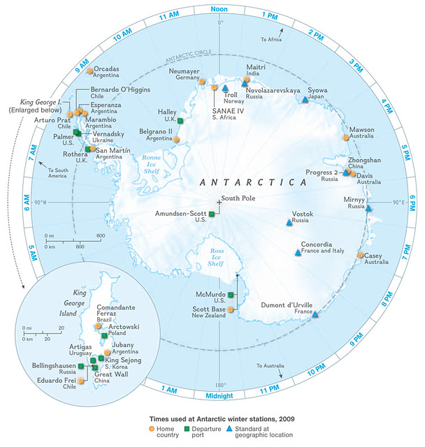
Lógicamente, los científicos siguen la hora universal (UTC), pero ¿por qué hora se rigen en cada una de sus estaciones? Como explican Shyr, muchos mantienen el horario de su país de origen (EEUU, Chile, etc), otros optan por mantener el horario de la ciudad de la que partió su avión o su barco y otros por seguir el tiempo que corresponde a ese determinado huso horario. Al final, una buena parte de los investigadores (de procedencia estadounidense) sigue el tiempo madre de Nueva Zelanda, que es desde donde llegan la mayoría hasta la estación de McMurdo.
Enlace: Antarctica, the Timeless Continent (National Geographic) | [Vía] | Ver también: El cajero de la base McMurdo (Fogonazos)
SAD Therapy
Maybe this is a lousy autumn, or maybe my tolerance for light starvation is ebbing as I age, but I seem to be working up an early case of Seasonal Affective Disorder, inflicting dark moods on my loved ones in a rhythm that echoes that of the storms and rain.
One palliative is to look at birds and flowers. This can be accomplished near my place in Vancouver with a visit to the Bloedel Floral Conservatory. It nestles at the summit of a big hill called Little Mountain, geodesic among the evergreens, which is to say totally Riven-esque when you see it from below. This dome detail’s background may help you understand why I’ve been feeling grey.

When you step inside, you’re instantly warm. It’s packed, jam-packed, with greenery and flowers and birds, also a pretty impressive koi-pond. The blossoms are a treat for color-starved eyes; here we have an orchid, a poinsettia, and, um, something yellow.


There are also many birds. The stars of the show are the large, brilliant-hued parrots, but I sort of prefer teeny feathered jewels like this guy.

And when we came out, there were some sunbeams inhabiting the view northeast across Vancouver.

Pocket Chain Saw

This little saw is excellent, fast cutting, light weight ( at 3 oz without the case), and folds up small making it highly portable. It can quickly saw branches and trees up to about 4-6 inches in diameter with its 28 inch long chain.
To use it, wrap the chain around whatever you want to cut and then grab the handles and pull back and forth. This flexibility means that it can take on logs and branches too thick for smaller camp saws. I’ve used it in the back country as well as around the yard.
When one of the metal loops that attaches the saw to the handles came apart at the weld point the company very quickly responded by sending me a new set of loops. It’s an excellent product supported by a conscientious and responsive company.
— Jaime Cobb
[Note: An even lighter weight military model can be purchased here.–OH]
Manufactured by Supreme Products
http://www.pocketchainsaw.com/
Available from Amazon
Supreme Products Pocket Chain Saw
$25
Repercusión global por histórica filtración de Wikileaks que desata crisis en la diplomacia de EEUU
El diario estadounidense The New York Times y varios diarios del mundo publicaron este domingo en sus sitios de Internet un largo artículo en el que se revela el contenido de cerca de 250.000 documentos diplomáticos estadounidenses divulgados por el sitio WikiLeaks.
Se trata “de un cuarto de millón de cables diplomáticos confidenciales estadounidenses”, escribe el diario, según el cual esas notas “ofrecen un panorama inédito de las negociaciones tras bambalinas tal como las llevaban adelante las embajadas en el mundo”.
Algunos de esos documentos son muy recientes, ya que datan de “el mes de febrero”, agrega The New York Times. Sumándose a los dichos del dirigente de WikiLeaks, Julian Assange, el diario indica que esos documentos abordan un gran número de temas.
“Los documentos que nos disponemos a publicar conciernen a todos los grandes temas en todos los países del mundo”, había advertido Assange el domingo.
Los 250.000 documentos filtrados por la web Wikileaks revelan que el Gobierno de Estados Unidos dio instrucciones a sus diplomáticos para que espiasen a políticos extranjeros y altos funcionarios de la ONU, entre ellos el secretario general de ese organismo, Ban Ki-moon.
Esta información forma parte de la filtración masiva de documentos diplomáticos que la web Wikileaks ha entregado a cinco publicaciones en todo el mundo y que pretendía dar a conocer a través de su propia web.
Sin embargo, esta misma mañana, Wikileaks denunció que su servidor había sido atacado y que no iba a estar operativo, por lo que la única manera de acceder a la información que ha recabado es a través de las cinco publicaciones que tuvieron los documentos previamente, El País (España), The New York Times (EE.UU.), The Guardian (Reino Unido), Der Spiegel (Alemania) y Le Monde (Francia).
El espionaje que se pide a los empleados de las embajadas y misiones abarca desde las gestiones y apariencia física de los diplomáticos iraníes y norcoreanos en Nueva York hasta los planes e intenciones del secretario general de la ONU, el surcoreano Ban Ki-moon.
Además, los archivos también hacen referencia sobre los esfuerzos por aislar al presidente de Venezuela, Hugo Chávez, y un pedido de información sobre la salud mental de la presidenta de Argentina, Cristina Fernández de Kirchner.
El resto de los documentos se irán revelando en sucesivas entregas. El diario “El País” señaló que entre éstos figuran algunos que dan cuenta de “los esfuerzos por cortejar a países de América Latina para aislar al venezolano Hugo Chávez” o de “las permanentes presiones que se ejercen sobre los diferentes gobiernos, desde Brasil a Turquía, para favorecer los intereses comerciales o militares de Estados Unidos”.
El diario indica que mañana lunes “ofrecerá detalles, por ejemplo, sobre las sospechas que la presidenta de Argentina, Cristina Fernández de Kirchner, despierta en Washington, hasta el punto de que la Secretaría de Estado llega a solicitar información sobre su estado de salud mental”.
Asimismo, agrega que “hay cables de gran valor histórico, como el que revela la apuesta de la diplomacia norteamericana por el derrocamiento del general panameño Manuel Antonio Noriega o el que detalla ciertos movimientos de Estados Unidos durante el golpe de Estado que destituyó a Manuel Zelaya en Honduras”.
Otras de las revelaciones de WikiLeaks, indica que el rey Abdalá de Arabia Saudita instó a Estados Unidos a atacar Irán para destruir su programa nuclear.
Los cables de embajadas estadounidenses en Oriente Medio filtrados dan cuenta de las “frecuentes exhortaciones a Estados Unidos para atacar Irán y poner fin a su programa de armas nucleares”.
Fuente: Ambito
The tourists love Barracuda for more than just beer

Barracuda on Fuller Street is known for their fish sandwiches and Magic Hat beer, also now for their Pumpkin Carving and Pet Costume Contest, but one thing you may not know is that it is the most commonly photographed building in the Grove by tourists.
They love the bright pink building and neon signs, they are constantly taking pictures there. Wouldn’t it be cool if the Grove was known for this — if all buildings were brightly painted like in Bermuda and the Bahamas? It’s something to think about.

Bacardi Sailing Week coming back to Grove

Norway’s Eivind Melleby and Petter Morland Pedersen at 2010 Bacardi Miami Sailing Week.
Following a successful inaugural year, Bacardi Miami Sailing Week (BMSW) will return to Coconut Grove, for its second annual running from March 6-12, 2011.
Featured at the week-long regatta will be the 84th running of the historic Bacardi Cup for the Star Class. The Bacardi Cup was conceived in 1927 as a three-day event with less than ten boats competing for the Trofeo Bacardi as part of Cuba’s Mid-Winter Championship. The regatta continued for 30 years until political unrest forced the Cup to move in 1962 from Havana to the Coral Reef Yacht Club in Coconut Grove. Since continuing ever since in the Grove, the Cup has grown into an internationally renowned sailing spectacle with as many as 200 world-class sailors representing 23 different countries, all channeling the grand tradition of camaraderie that has made the event so cherished by its participants.
The event will be a six-day experience that will gather national and international sailing classes together in a fun-filled week of regattas, awards ceremonies, parties, and cultural exhibits. The racing begins on March 7, with events scheduled daily through March 12. The prestigious Coral Reef Yacht Club will coordinate on-water activities in collaboration with Biscayne Bay Yacht Club and Coconut Grove Sailing Club. The U.S. Sailing Center and Shake-A-Leg Miami will also support the event. Racing will be held on three separate courses approximately two miles out on Biscayne Bay. Event registration is online at www.MiamiSailingWeek.com.
Photo by Cory Silken.
Lots of new art to see tonight for Art Basel night

The large sculptures by John Angee are in the Mayfair Atrium, there are three of them, near where the bull used to be. The bull is now pushed back and stands behind them. They will be premiered tonight during the Coconut Grove Art Basel event.

You can get an idea of the size with Nicky standing under them. They are sure to be the spot for most of the picture taking tonight.

Outside the Coconut Grove Arts Festival Gallery, is recycled lawn furniture, you may remember these items from Park(ing) Day. The Arts Festival Gallery has two spaces for Art Basel, their usual location in the Atrium and the former Palm Produce spot out front on Grand Avenue. The Atrium is also the place for the after party tonight.

12 galleries will be showing their best tonight for Art Starts in the Grove, to welcome Art Basel to Miami. The Blu Moon Studio will be featuring the works of Sheri Friedman, Aleloop, Atena Komar, Peter Barreda, Carolina Nelida Gauna and Lourdes Orta.
Above is work by Aisha Blakey, a top Art Basel award winner. She will be on hand tonight at the Max in the Grove Gallery (2996 McFarlane Road).
All the galleries will be showing off special works and as much as I didn’t want to like it because they took the space of the Windisch-Hunt Gallery, I do like the new AC Fine Art (2911 Grand Avenue). Having just come back from New York and visiting the Museum of Modern Art, I really like seeing the pop art all over the new gallery.
There will be drink and dinner specials all over town from 7 -10 pm. The galleries will be open until 11 pm. Then there is the After Party at the Mayfair Promenade which begins about 9ish. Parking is only $1.00 for the whole night at the Oak Plaza Garage, which is right near the Atrium. Get a pass at the BID office.
During the week of November 29 – December 5, all galleries will be open until at least 9 pm.


Se traga una pastilla para ser un reproductor andante

Hay algunas canciones que nos llegan al estómago. Pero nunca será lo mismo que con este hombre, Fredrik Hjelmqvist, CEO de Pause Home Entertainment Store. Él se ha tragado un reproductor de música inalámbrico, de modo que va a sentir la música mejor que nadie. Su objetivo no es otro que publicitarse, conviertiéndose en la máquina de discos ambulante. Mira otros detalles y cómo se lo traga, si quieres, tras dar el salto.
Click here to view the embedded video.No pensé que uno pudiera tragarse tal pastillón. ¡Si es como su barbilla! La pastilla-reproductor recibe el nombre de “gutpod”, algo así como “cápsula para la tripa”.
¿Y exactamente cuáles son sus intenciones? Mejor que nos lo explique él:
Click here to view the embedded video.
Nos cuenta que podrás seleccionar las canciones que quieres que suenen en su gutpod entrando en www.thehumanjukebox.se, las cuales, por supuesto, se reproducirán en su estómago. La cápsula tiene un receptor inalámbrico para que le llegue la canción a reproducir, por lo visto, a través de Spotify. ¿Se le podrá poner Death Metal a las 5 de la madrugada?
Próximamente subirá más vídeos, esperemos que alguno con la música oyéndose desde su estómago, aunque entre la atenuación del sonido por el propio cuerpo y el pequeño tamaño de los altavoces, podemos imaginar que no será como un concierto.
¡Menuda forma de publicitarse! Me pregunto si la cosa le saldrá bien. Igual de lo bien que le ha entrado. — Javier G. Pereda [Human Jukebox]
La botella de Klein abrebotellas no abre botellas de Klein

¿Sabéis quién es Klein?
No, no me refiero a Calvin Klein, sino a un señor llamado Felix Klein, matemático alemán. No sabemos si le daba a las birras tanto como nosotros, pero en cualquier caso un buen día se le ocurrió hacer una superficie curvada de forma un tanto extraña, ahora conocida como botella de Klein (todo apunta a que, a pesar de las apariencias, iba lúcido). ¿Y qué mejor que usarla para abrir cervezas? Si amas la cerveza y las matemáticas por igual, puedes verla en detalle tras un salto.

No quiero ni imaginar cómo puede ser un matemático borracho explicando que lo que está usando para abrirte la penúltima cerveza (mientras no lo consigue) es en realidad una superficie no orientable con característica de Euler igual a cero que no tiene ni interior ni exterior. Ligando tiene que ser un fiera…

En cualquier caso, algo bebido hay que estar para gastarse los 78 dólares que vale un abrebotellas de estos. ¡Si ni siquiera puede abrir otras botellas de Klein! El día que eso ocurra se creará una paradoja espacio-temporal y nos explotará la cabeza. — Javier G. Pereda [Bathsheba Sculpture]
Un toque de elegancia para tu Macbook con fundas de madera

¿Harto de tantas superficies metalizadas? Sin duda viene siendo la moda desde hace muchos años en cualquier gadget. Metal reflectante, metal cromado, pero metal por lo general gris y frío. Incluso los maletines de plástico los hacen de forma que simule metal. ¿Quieres un toque de naturalidad y distinción? Pues si tienes un Macbook Pro, es el momento con estas fundas de madera. Tienes sus detalles tras un salto.

Cada funda ha sido lijada, pulida y ha recibido su aceite protector a mano, además de tener una numeración individual.

Su peso es de unos 680 gramos. Hay una para Macbooks de 13 pulgadas y otra para los de 15, ambas por 129 dólares, casi 100 euros, que puedes encontrar en Blackbox Cases. Disponibles en dos tonos, el de la imagen inmediatamente superior, más claro, y el de la primera, algo más oscuro.
Esto sí, mejor no lo saques si ves que llueve. — Javier G. Pereda [BlackBox]
Internet y la Universidad, ¿quién enseña a quién?

Leía esta mañana un fantástico artículo en el diario Telegraph sobre la enseñanza actual. El profesor y científico de Oxford y Cambridge, Adrian Hon, se preguntaba sobre las diferencias entre la enseñanza actual pública y privada y la necesidad de cambio para adaptarse a los nuevos tiempos y la web 2.0. La pregunta que se hacía el maestro, en el entorno del Reino Unido, es perfectamente extrapolable al resto del globo. ¿Se han quedado obsoletos los antiguos sistemas públicos de pedagogía frente a Internet y la lectura gratuita online?
Si bien, la enseñanza universitaria tiene sobre el alumno un efecto de sendero o camino por el que llevar a los jóvenes a la comprensión de las materias, las temáticas y la forma de dar e impartir las clases no se han adaptado a lo que demanda la sociedad. No resulta chocante imaginar una clase hoy en la que el profesor se encuentre en una sala dando su teoría mientras los alumnos sueñan despiertos o teclean como zombies las pantallas de sus móviles, participando a través de las redes sociales en el debate que a ellos les interesa.
Es por esto que quizá, más que nunca, el aprendizaje resultaría efectivo y recibiría el feedback necesario del alumno si se empezara a impartir en el lenguaje que los jóvenes ya conocen, Internet. Iniciativas como las que contamos hace unas semanas, donde una Universidad Pública de Madrid había incluido en su temario a las redes sociales como asignatura son de un valor incalculable. Muchos escribisteis sobre másters que también llevaban tiempo ofreciendo el estudio de los nuevos lenguajes y las formas de comunicación.
El título de esta entrada hace referencia a una de las grandes diferencias que encontramos hoy con el pasado más reciente. Antes de la llegada de la red solamente existía una vía de información. La enseñanza en las escuelas era paso obligatorio para entender el mundo y lo que en él acontecía. Los libros y las clases impartidas eran la única forma de transmitir la información. Ahora no. El internauta no sólo encuentra información sobre todo aquello que acontece, sino que el debate y las dudas las puede resolver online, al momento y con inmediatez. ¿Tiene algún sentido que 140 caracteres resulten más influyentes o inspiradores que una clase teórica en la Universidad? Seguramente la clave no sea si lo tiene o no, sino por qué no se aplica para enseñar a las generaciones que nos llegan de lo potente que son las herramientas que existen en la red y que las tienen al alcance de la mano.
Otras Universidades y centros de estudio como la de Harvard o el propio MIT sí son pioneras en la temática actual, llegando a ofrecer conferencias y clases online e incluso con posibilidad offline, un catálogo de temáticas sorprendente, aunque ésta se podría decir que es la élite y no todos pueden acceder a ella.
Son muchas las ventajas que ofrecen estos centros de “alto rendimiento” que se podrían aplicar a los centros públicos con coste bajo. Clases de matemáticas en vídeo, conferencias online y podcast (y la posibilidad de buscar, parar o acceder al temario que se requiere en ese momento) e incluso enviar preguntas al profesor con una interacción y pérdida de la vergüenza total. El contacto directo, el cara a cara, una de las grandes virtudes de las Universidades adquiere mayor relevancia con el feedback real y continuo que encontramos en la web.
En mi opinión, todo estos cambios no hacen más que enriquecernos, los medios digitales los tenemos gratis en la web y no deberían ser un problema para la enseñanza actual. Si la Universidad nos forma, Internet transforma estos modelos y si la Universidad tiene el valor añadido del pensamiento crítico, el trasvase de toda la pedagogía a los nuevos formatos conseguiría una enseñanza completa, a la vez que formaría personas más capaces. Personalmente no concibo un mundo sin Internet, y muy probablemente vosotros, los lectores, tampoco. Es por esto que no sólo las Universidades deben formar también a partir de la red, sino que deben promover la opinión de lo que allí ocurre estos días. Temas candentes como la privacidad, los cambios sociológicos por las tecnologías o el mismo debate sobre la neutralidad en la red deben ser promovidos por la pedagogía, para que la discusión y la opinión crítica forme a los jóvenes.
Internet y la Universidad, ¿quién enseña a quién? escrita en Bitelia el 26 November, 2010 por miguel-jorge
Enviar a Twitter | Compartir en Facebook
Baja fotos y sets de Flickr en Chrome con DownFlickr✔

DownFlickr es una extensión para Chrome que nos facilita el proceso de descargar fotos de Flickr. Nos coloca un botón en la barra de herramientas por medio del cual podemos bajar tanto la foto que estamos viendo en la calidad más alta como el set completo (y todas las fotos también el tamaño más grande).
Para bajar la foto que queramos, debemos hacer clic en el botón y en el cuadro, pinchar en Get y después en la miniatura que se nos desplegará. En el caso de los sets, viene a ser casi lo mismo: tras pulsar Get, se despliegan miniaturas de todas las imágenes. De ahí, pinchamos en “Open all” y se nos abrirá otra ventana donde se empezarán a descargar las fotos.
Los sets los despliega en grupos de treinta fotos. Para poder descargar sets con muchas fotos, hay que darle varias veces al botón +30 (que antes era Get) para que se cargue el resto.Si al desplegarse un set en el cuadro hacemos clic en una sola foto, se descargará nada más que esa. Tener marcada la opción “Autodownload” nos permite que las fotos se descarguen directamente, porque si no se abrirán en otra pestaña.
Una extensión muy recomendable para aquellos que gusten de Flickr y de bajar fotos de este servicio, uno de los más populares de la web.
Enlace | DownFlickr
![]()
Engaño en Facebook para ganar dinero con publicidad
Hemos hallado un simpático caso de publicidad oculta en mensajes engañosos de Facebook.
El funcionamiento inicial es sencillo y se basa en intentar lograr que la mayor cantidad de usuarios posibles ingresen a una noticia falsa: Se suicido al ver lo que le publico su padre, y como mencioné el objetivo es publicitar un sitio y hacer dinero con él.

En ese mensaje se pueden observar dos enlaces: el primero a una aplicación de Facebook (ID 105956641876) que ya hemos denunciado y el segundo a un sitio registrado gratuitamente.
Si se hace click sobre el segundo enlace simplemente se acorta el camino hacia el engaño que se logra con el enlace de la aplicación, y que se explica a continuación.
Si se hace click en el enlace de la aplicación pueden suceder dos cosas:
1. Si no se tienen bloqueados los scripts en el navegador, somos redireccionados a la misma página que se visualiza en la parte inferior,mediante un script colocalo al comienzo de la aplicación. Aquí está el código fuente que se ejecuta:

Luego, se solicita autorización para instalar la aplicación en nuestro perfil, lo cual le dará al delincuente la posibilidad de postear mensajes en nuestro muro.

2. Si se tienen bloqueados los scripts en el navegador aparecen las “maravillas del engaño” en donde mediante un frame se coloca una página falsa encima del sitio verdadero de Facebook, logrando que el usuario crea que es una aplicación confiable con millones de seguidores:

En código fuente que realiza esta acción es el siguiente, en donde también se puede ver la referencia al sitio falso dentro del frame mencionado:

Lo interesante del caso es que si se observa con atención el frame, se pueden ver los datos del sitio que originó este engaño y los objetivos de su autor: realizar publicidad de su sitio y lograr ganar dinero con los click de los usuarios.
Como puede verse se trata del sitio http://www.cel[ELIMINADO].net que oculta su dirección detrás del acortador de URL TinyURL que en la imagen aparece resuelto con el dominio real.
El dominio está registrado a nombre de Federico M. desde octubre de 2010 e incluso puede encontrarse mucha información de esta persona en Twitter, ofreciendo “trucos” para este tipo de acciones en la red social:

Con respecto a la información brindada por la aplicación es lamentable ver que, al momento de escribir el presente, tenia al alrededor de 1400 seguidores reales que han caído en el engaño y han instalado la aplicación:

Tanto la aplicación como el sitio falso han sido denunciados y seguramente se darán de baja a la brevedad.
El sitio TK falso aloja el contenido de la página de la aplicación y también algunas versiones previas del mismo engaño:

En cuanto al sitio de Federico M., que intenta vendernos sus productos, luce de la siguiente manera:

Esto demuestra algunas cosas:
- Los delincuentes ganan lo suficiente como para tomarse la molestia de realizar este tipo de engaños logrado con cierto conocimiento del lenguaje HTML.
- Facebook no hace nada para prevenir estos códigos que se ocultan detrás de frames. ¿Tan difícil es para Facebook difícil bloquear este tipo de aplicaciones que cumplen con estas características particulares? No lo creo.
- Todos los usuarios tenemos la necesidad de educarnos y capacitarnos en esta temática.
Internet no es gratis, pagamos con nuestra identidad.
Cristian de la Redacción de Segu-Info


You must be logged in to post a comment.